flowchart LR A(1. Create Dataset) --> B(2. Scale Dataset) B --> C(3. Select all Health-\nRelated Variables) C --> D(4. Project those health \nmetrics to the first eigenvalue) D --> E(5a. Assess contribution of \neach health variable) D --> F(5b. Assess projection value \nof all other variables) D --> G(5c. Assess projection value by \ncounty then average by state)
1 Introduction
To investigate the current health status of individuals in the United States and propose metrics to improve health, we explored relationships between county health rankings and overall health outcomes.
We first took a broad look at our data and engineered a variable to represent overall health. Using this new variable, we discovered what factors are most important to health as a whole.
Then, we focused in our search onto just how access to care and other basic needs impact health. Prior research has suggested access to affordable preventative care has a tremendous impact on health quality,¹¹𝄒¹⁴ so we quantified the extent to which this occurs. We used common health metrics such as life expectancy, mortality, and infant mortality⁸ as proxies for measuring health.
By examining these relationships, we aimed to contribute to the understanding of how increasing access to care and other basic needs can improve the deterioriating public health in the United States.
2 Background
In the world today, there is a growing problem of increasingly poor health across the globe. While life expectancy has increased, the amount of years spent in poor health has also increased proportionally.³ Within the United States in particular, recent reseach has revealed not only that “the U.S. [has] the lowest life expectancy among high-income countries, but it also has the highest rates of avoidable deaths” despite spending almost 18% of its Gross Domestic Product (GDP) on healthcare. In comparison, the second-highest spender on healthcare is Germany at 12.8%. Furthermore, the United States has almost double the obesity rate than other high-income countries and its citizens are more likely to suffer with multiple chronic conditions.¹⁰ It is no question that finding a solution to this health endemic is vital to Americans’ health- but what is the answer?
Other research has already attempted to answer this question and found that:
[a]lthough spending did not correlate meaningfully with health, certain features of the [United States’] health care system did correlate highly with health outcomes, notably rates of health insurance coverage and access to affordable care (not having to forego care due to cost)… [H]ealth outcomes were better in states with adequate primary care services to manage chronic diseases and prevent hospitalizations for conditions like heart attacks, congestive heart failure, and pneumonia.¹⁴
This comes as no surprise; preventative care is generally accepted as one of the most important factors in maintaining health. Daily exercise, access to healthy foods, minimal consumption of alcohol, and not smoking are all important factors for improving and maintaining one’s health.¹¹ The above underscores the reality that, even if a person is uninsured, having access to primary care helps prevent against their need to go to a hospital and risk getting caught with a tremendous bill due to their uninsured status.
Free clinics and Direct Primary Care (DPC) models offer the solution. While free clinics are, of course, free, they require patients to make less than a certain amount to qualify for care. On the other hand, DPCs do not bill insurance and charge a flat-rate monthly membership instead, thus allowing individuals access to primary care at an accessible and affordable cost.¹ In particular, DPCs paired with a healthshare offer people the most options at an affordable rate, as their healthshare could cover the cost of specialists, imaging, DPC membership fees, and other healthcare-related expenses as needed.⁶
As for insurance’s impact on health, measuring it becomes tricky in the United States. Though countries with univeral public health insurance are healthier at the global level, the United States is the only high-income country to not offer health coverage to all citizens.⁹𝄒¹⁰ Instead, both private and public healthcare co-exist, where neither option is available to all.
In the United States, public healthcare is available to those who are disabled or over 65 years old through Medicare. Medicare is not always free, but generally more affordable than private health insurance. Low income Americans can also receive free public healthcare through Medicaid. Public healthcare is funded through both federal and state health expenditures.
While this system may have been implemented with good intentions, the current reality is that for-profit institutions are disincentivized from accepting Medcaid and Medicare patients. This is because public health insurance in the United States reimburses health centers at a low rate- much lower than private insurance. As of 2022, when our data was collected, Medicare reimbursement was at an all-time low. By the end of the year, this added up to $99.2 billion in unpaid Medicare treatments.²
Sadly, research has also shown that Medicaid patients have reduced access to care.¹² Medicaid populations are made up of a more diverse population than the rest of the United States’ population, which means our minority populations and those most of need in care have the hardest time getting it.⁴ This is a problem and needs a solution. Our research seeks to face this problem by providing knowledge and resources to those who have found themselves in need of care and/or basic needs but cannot access or afford it.
3 Data
3.1 Data Ingestion
We gathered data from two sources: KFF (which does not represent anything but is an independent source for health policy research, polling, and news)¹³ and County Health Rankings and Roadmaps (CHRR).⁵ Though we collected data across several years, we analyzed only data from 2022 due to discrepancies found across years.
3.1.1 KFF: Collection and Cleaning
We generated a custom report from data available on KFF, downloading a large variety of data from 2017-2022 (not including 2020 due to lack of data collection) for each state in the U.S. Variables we investigated from this dataset included percentage of population on Medicare, percentage of adults who smoke, healthcare expenditure, median annual household income, cervical cancer incidence rate, and many more potentially relevant factors.
KFF data for each state was downloaded as CSVs. We chose the most recent dates for all of the different health and insurance-related factors between 2017-2022. The CSVs originally had a question, state, and value field. We used text parsing to create a column called demographic and a column called group. This allowed us to parse out demographics like age, race/ethnicity, poverty level and create groups within each of those. (See below for a full working example of how we did this with the CHRR data.)
We also created fields called year and measure, and parsed out the years and measurements from the question field. Some questions had multiple demographics, so we created a secondary_demographic field and a secondary_group field. These are not ranked.
Finally, we added a county column (which we filled with all NA) and edited the state and question fields to replicate the way that data from our CHFF dataset was formatted. This allowed us to merge the two datasets.
See below for examples of what our data looked like before and after cleaning.
|                                   |United States|Alabama|Alaska|Arizona|Arkansas|California|
|-----------------------------------|-------------|-------|------|-------|--------|----------|
Total Nonelderly with Medicaid, 2022|             |       |      |       |        |          |
Medicaid                            |22.6%        |22.2%  |24.5% |22.8%  |30.4%   |28.0%     |
Nonelderly with Medicaid by Age, 2022|            |       |      |       |        |          |
Children 0-18                       |48.1%        |60.3%  |46.6% |46.3%  |50.2%   |41.8%     |
Adults 19-64                        |51.9%        |39.7%  |53.4% |53.7%  |49.8%   |58.2%     |
Total                               |100.0%       |100.0% |100.0%|100.0% |100.0%  |100.0%    |
Nonelderly with Medicaid by Race/Ethnicity, 2022| |       |      |       |        |          |
White                               |39.4%        |44.9%  |36.8% |30.0%  |56.3%   |18.7%     |
Black                               |19.1%        |40.0%  |N/A   |5.3%   |21.6%   |6.6%      |
Hispanic                            |29.5%        |8.7%   |9.0%  |51.2%  |10.6%   |60.1%     |
Asian/Native Hawaiian or Pacific Islander|4.7%    |1.0%   |8.3%  |1.9%   |1.3%    |10.0%     |
American Indian or Alaska Native    |1.0%         |0.3%   |26.6% |7.3%   |0.5%    |0.3%      |
Multiple Races                      |6.3%         |5.2%   |15.0% |4.3%   |9.7%    |4.3%      |
Total                               |100.0%       |100.0% |100.0%|100.0% |100.0%  |100.0%    |
Nonelderly with Medicaid by Federal Poverty Level (FPL), 2022| | | | | | |
Under 100%                          |33.9%        |42.0%  |32.0% |34.1%  |38.7%   |27.7%     |
100-199%                            |30.6%        |30.1%  |31.2% |32.3%  |33.1%   |30.3%     |
200-399%                            |25.0%        |21.0%  |23.4% |24.0%  |22.6%   |29.0%     |
400% |10.5% |6.9% |13.5% |9.6% |5.6% |13.0% || Question | State | Value | Measure | Year | Demographic | Group | Secondary Group | Secondary Demo | County |
|--------------------------------------------------|---------------|-----------|---------|------|-------------|-----------|-----------------|----------------|--------|
| `TOTAL NONELDERLY WITH MEDICAID, 2022 MEDICAID` | United States | 22.6 | % | 2022 | Instances | NA | NA | NA | NA |
| `TOTAL NONELDERLY WITH MEDICAID, 2022 MEDICAID` | Alabama | 22.2 | % | 2022 | Instances | NA | NA | NA | NA |
| `TOTAL NONELDERLY WITH MEDICAID, 2022 MEDICAID` | Alaska | 24.5 | % | 2022 | Instances | NA | NA | NA | NA |
| `TOTAL NONELDERLY WITH MEDICAID, 2022 MEDICAID` | Arizona | 22.8 | % | 2022 | Instances | NA | NA | NA | NA |
| `TOTAL NONELDERLY WITH MEDICAID, 2022 MEDICAID` | Arkansas | 30.4 | % | 2022 | Instances | NA | NA | NA | NA |
| `TOTAL NONELDERLY WITH MEDICAID, 2022 MEDICAID` | California | 28.0 | % | 2022 | Instances | NA | NA | NA | NA |
| `TOTAL DEATHS, 2022 NUMBER OF DEATHS` | United States | 3,279,857 | NA | 2022 | Instances | NA | NA | NA | NA |
| `TOTAL DEATHS, 2022 NUMBER OF DEATHS` | Alabama | 62,294 | NA | 2022 | Instances | NA | NA | NA | NA |
| `TOTAL DEATHS, 2022 NUMBER OF DEATHS` | Alaska | 5,719 | NA | 2022 | Instances | NA | NA | NA | NA |
| `TOTAL DEATHS, 2022 NUMBER OF DEATHS` | Arizona | 74,082 | NA | 2022 | Instances | NA | NA | NA | NA |
| `TOTAL DEATHS, 2022 NUMBER OF DEATHS` | Arkansas | 37,855 | NA | 2022 | Instances | NA | NA | NA | NA |
| `TOTAL DEATHS, 2022 NUMBER OF DEATHS` | California | 313,161 | NA | 2022 | Instances | NA | NA | NA | NA |3.1.2 CHRR: Collection and Cleaning
Similar to KFF, we downloaded data for each state from 2017-2022 (not including 2020 due to lack of data collection) from County Health Rankings and Roadmaps (CHRR). We chose the “20xx County Health Release National Data” links for each year as they were the CSVs with the most relevant data to our project.⁵ Data from CHRR originally came in two separate CSVs for each year and broke up the data by each county in the United States. This data included metrics such as life_expectancy, age-adjusted_death_rate, years_of_potential_life_loss_rate, food_environment_index, percentage_of_physically_inactive_adults, percentage_of_excessive_drinking, Primary_Care_Provider_ratio, and much more.²
First, we cleaned up the columns. We reviewed the documentation and renamed any potentially confusing column names. For example, #_Medicaid_Enrollees became no_female_medicaid_enrollees to avoid mistakenly believing the first column included both genders in its count. We dropped columns that would not be of help to us, such as columns containing the word Unreliable. We replaced all spaces with an underscore.
Second, we joined the two CSVs for each year to have one CSV per year and added a Year column to help with merging later.
Finally, we reformatted the CSVs to match that of the KFF data, where our original columns became the question column and the values filled in a new values column. Again, we used text parsing such as grepl and gsub to fill in our newly created demographic, measure, group, secondary_demographic, and secondary_group, columns.
For example, if our question was mean_%_Children_in_Poverty_(white), our demographic, group, secondary_demographic, and secondary_group columns became “Race/Ethnicity”, “White”, “Age”, and “0-17”, respectively. See the code below for a full example.
chrr_2022_by_state = chrr_2022_join %>%
  pivot_longer(cols="Deaths":"%_rural", names_to = "question", values_to = "Value") %>%
  mutate(Measure = case_when(
    grepl("Income|income|spending|funding|Spending|Funding|Earning|earning", question) ~ "$",
    grepl("%|Rate|rate", question) ~ "%",
    grepl("score|Score", question) ~ "Score",
    TRUE ~ "Instance"
  )) %>%
  mutate(Demographic = case_when(
    grepl("White|Asian|Black|Hispanic|Native_Hawaiian/Other_Pacific_Islander|American_Indian|Alaskan_Native|white|asian|black|hispanic|native_hawaiian/other_pacific_islander|american_indian|alaskan_native|AIAN", question) ~ "Race/Ethnicity",
    grepl("3|4|6|7|8|9|0|Youth|Child|Adult|youth|child|adult|<|>|teen|Teen|juvenile|Juvenile", question) ~ "Age", #can't have 1 due to A1C or 2 or 5 due to PM2.5
    grepl("female|Female|male|Male|women|Women|Woman|woman|_men's|_Men's", question) ~ "Gender",
    TRUE ~ "Instances"
  )) %>%
  mutate(Group = case_when(
    grepl("White|white", question) ~ "White", #white has to be before hispanic due to instances of "non-hispanic white"
    grepl("Asian|asian", question) ~ "Asian",
    grepl("Hispanic|hispanic", question) ~ "Hispanic",
    grepl("Black|African_American|black|african_american", question) ~ "Black",
    grepl("Native_Hawaiian/Other_Pacific_Islander|native_hawaiian/other_pacific_islander", question) ~ "Native_Hawaiian/Other_Pacific_Islander",
    grepl("American_Indian|Alaskan_Native|AIAN|american_indian|alaskan_native", question) ~ "American_Indian/Alaskan_Native",
    grepl("Youth|Child|youth|child|juvenile|Juvenile", question) ~ "0-17", #found from documentation
    grepl("Teen|teen", question) ~ "15-19",
    grepl("over_24", question) ~ "25+",
    grepl("Adult|adult", question) ~ "20-75",
    grepl("25_to_44", question) ~ "25-44",
    grepl("<_18|Less_Than_18_Years_of_Age", question) ~ "0-17",
    grepl("65_and_over|65_and_Over", question) ~ "65+",
    grepl("female|Female|woman|women|Woman|Women", question) ~ "Female",
    grepl("_men's|_Men's|_man's|_Man's", question) ~ "Male",
    TRUE ~ NA
  )) %>%
  mutate(secondary_demographic = case_when(
    Demographic == "Race/Ethnicity" & grepl("3|4|6|7|9|Youth|Child|Adult|youth|child|adult|<|>|teen|Teen|juvenile|Juvenile", question) ~ "Age",
    TRUE ~ NA
  )) %>%
  mutate(secondary_group = case_when(
    !is.na(secondary_demographic) & grepl("Youth|Child|youth|child|juvenile|Juvenile", question) ~ "0-17",
    !is.na(secondary_demographic) & grepl("Teen|teen", question) ~ "15-19",
    !is.na(secondary_demographic) & grepl("over_24", question) ~ "25+",
    !is.na(secondary_demographic) & grepl("Adult|adult", question) ~ "20-75",
    !is.na(secondary_demographic) & grepl("25_to_44", question) ~ "25-44",
    !is.na(secondary_demographic) & grepl("<_18|Less_Than_18_Years_of_Age", question) ~ "0-17",
    !is.na(secondary_demographic) & grepl("65_and_over|65_and_Over", question) ~ "65+",
  )) %>%
  mutate(Measure = as.factor(Measure),
         Demographic = as.factor(Demographic),
         Group = as.factor(Group),
         secondary_demographic = as.factor(secondary_demographic),
         secondary_group = as.factor(secondary_group))
Since the questions and potential answers collected by CHRR data varied each year, we made sure that our cleaning code was modified for each year to accommodate the changes in the data and match identical answers from previous years. As an example, the only races that were listed as options in the 2017 data were “White”, “Black”, “Hispanic”, and “Asian”. However, by the 2022 data collection, the options had expanded to include “American Indian/Alaskan Native”, “Native Hawaiian/Other Pacific Islander”, and “Other/Multiple Races.” In 2022, “Black” was changed to “African American,” so we changed it back to “Black” to both match the earlier CHRR data and the KFF data.
See below for a sample of our pre- and post-cleaned data.
| FIPS | State   | County  | Deaths | Years_of_Potential_Life_Lost_Rate | YPLL_Rate_(AIAN) | YPLL_Rate_(Asian) | YPLL_Rate_(Black) | YPLL_Rate_(Hispanic) |
|------|---------|---------|--------|-----------------------------------|------------------|-------------------|-------------------|----------------------|
| 1000 | Alabama | NA      | 88086  | 10350                             | 5967             | 3411              | 13245             | 5244                 |
| 1001 | Alabama | Autauga | 836    | 8027                              | NA               | NA                | 11549             | NA                   |
| 1003 | Alabama | Baldwin | 3377   | 8118                              | NA               | NA                | 11603             | 4591                 |
| 1005 | Alabama | Barbour | 539 | 12877 | NA | NA | 15534 | NA || State | County | Year | Question | Value | Measure | Demographic | Group | Secondary Demographic | Secondary Group |
|------------|----------|------|-----------------------------------|-------|---------|----------------|------------------------------------|-----------------------|-----------------|
| Alabama | NA | 2022 | `DEATHS` | 88086 | Instance| Instances | NA | NA | NA |
| Alabama | NA | 2022 | `YEARS_OF_POTENTIAL_LIFE_LOST_RATE` | 10350 | % | Instances | NA | NA | NA |
| Alaska | Kusilvak | 2022 | `CHILD_MORTALITY_RATE_(AIAN)` | NA | % | Race/Ethnicity | American_Indian/Alaskan_Native | Age | 0-17 |
| Alaska | Kusilvak | 2022 | `CHILD_MORTALITY_RATE_(ASIAN)` | NA | % | Race/Ethnicity | Asian | Age | 0-17 |
| Arizona | Graham | 2022 | `TEEN_BIRTH_RATE_(AIAN)` | 56 | % | Race/Ethnicity | American_Indian/Alaskan_Native | Age | 15-19 |
| Arizona | Graham | 2022 | `TEEN_BIRTH_RATE_(ASIAN)` | NA | % | Race/Ethnicity | Asian | Age | 15-19 |
| Arkansas | NA | 2022 | `%_LBW_(ASIAN)` | 9 | % | Race/Ethnicity | Asian | NA | NA |
| Arkansas | NA | 2022 | `%_LBW_(BLACK)` | 15 | % | Race/Ethnicity | Black | NA | NA |
| California | Inyo | 2022 | `%_CHILDREN_IN_POVERTY_(AIAN)` | 16 | % | Race/Ethnicity | American_Indian/Alaskan_Native | Age | 0-17 |
| California | Inyo | 2022 | `%_CHILDREN_IN_POVERTY_(ASIAN)` | NA | % | Race/Ethnicity | Asian | Age | 0-17 |3.2 Data Organization
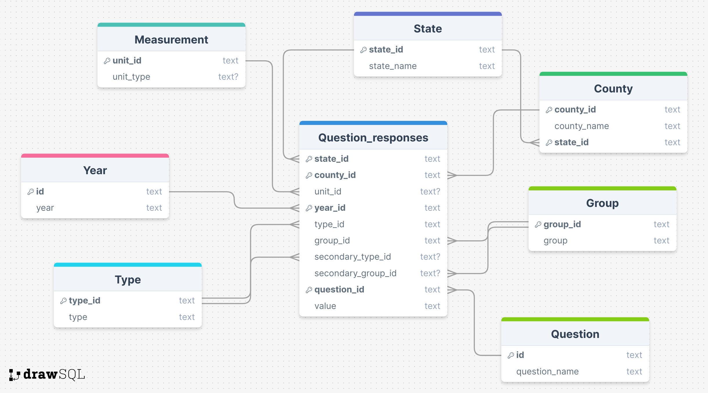
Data was combined and normalized to third normal form (see Figure 1). The ids were primary keys for each table except for question_responses, where state_id, year_id, and question_id were used as a compound primary key. We used the same foreign key for group and secondary_group and another separate foreign key for both type and secondary_type. All columns had a NOT NULL constraint except for unit_type from the unit table, and unit_id, secondary_group_id, and secondary_type_id from question_responses. We kept all numeric data as datatype “text” for simplicity and out of data quality concerns with PostgreSQL’s numeric datatypes. We converted numbers to numeric values in R and Python.
4 Methods
Our project focused on two main goals:
- Engineer an “overall” health metric to detect what variables influence health as a whole.
- Discover how access to care impacts life expectancy, infant mortality, and mortality.
See below for a thorough explanation of how we accomplished both goals.
4.1 Creating an Overall Health Quality Variable
4.1.1 Flowchart
4.1.2 More detailed explanation
- Gather our entire dataset (not just access to care related variables). Drop all NAs and variables related to count data (we kept only rates and percentages). See Section 8.1.1 for a list of all variables used.
- Preprocess the dataset using StandardScaler and OneHotEncoder to the appropriate columns (numeric and categorical, respectively). This converts our data to completely similarly scaled numeric data to ensure equal contributions from each variable to the final output.
- Select the following variables to summarize health:
LIFE_EXPECTANCY,AGE-ADJUSTED_DEATH_RATE,YEARS_OF_POTENTIAL_LIFE_LOST_RATE,%_FREQUENT_PHYSICAL_DISTRESSand%_FREQUENT_MENTAL_DISTRESS.AGE-ADJUSTED_DEATH_RATE,YEARS_OF_POTENTIAL_LIFE_LOST_RATEboth represent mortality rates.%_FREQUENT_PHYSICAL_DISTRESS,%_FREQUENT_MENTAL_DISTRESSrepresent the percent of adults who report having 14 or more days of poor physical and mental health, respectively, per month. We chose these variables for multiple reasons:- As stated previously, life expectancy, mortality, and infant mortality are common metrics used to assess the health of a population.⁸ Note we dropped infant mortality due to its high rate of NAs.
- Percieved health, as measured by
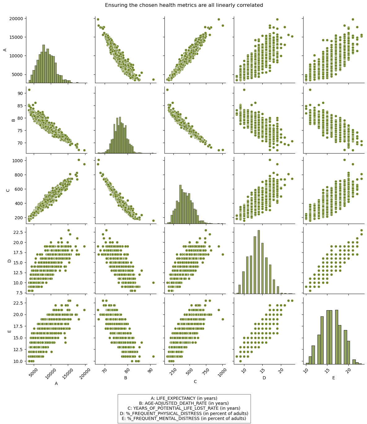
%_FREQUENT_PHYSICAL_DISTRESSand%_FREQUENT_MENTAL_DISTRESS, also has an impact on one’s actual health. - We confirmed the linear relationship between each of these variables in a pair-plot (see Figure 2), confirming their interconnectedness and validity in using as a summarized health metric.
- Project desired health variables to the first eigenvalue.
pca_all = Pipeline([('transfomer', transformer_all), #need to use transfomer since have both categorical and numeric data
                         ('pca', PCA(1))]) #only project to first one

pca_all.fit(ds_no_nan)

# Extract the PCA components
pca_components = pca_all['pca'].components_

# Get the first eigenvalue component
first_eigenvalue_component = pca_components[0]

# Select the columns to project
columns_to_project = ['YEARS_OF_POTENTIAL_LIFE_LOST_RATE','LIFE_EXPECTANCY', 'AGE-ADJUSTED_DEATH_RATE', '%_FREQUENT_PHYSICAL_DISTRESS', '%_FREQUENT_MENTAL_DISTRESS']

# Assuming X_train_all is a DataFrame
selected_columns = ds_no_nan[columns_to_project]

# Transform the selected columns using the first eigenvalue component
projected_values = selected_columns.dot(first_eigenvalue_component[:len(columns_to_project)])- Assess contributions and projection values of variables and states.
- Assess contribution of each health variable by multiplying the corresponding element from the first eigenvalue by each of the selected columns and then summing each columns’ products.
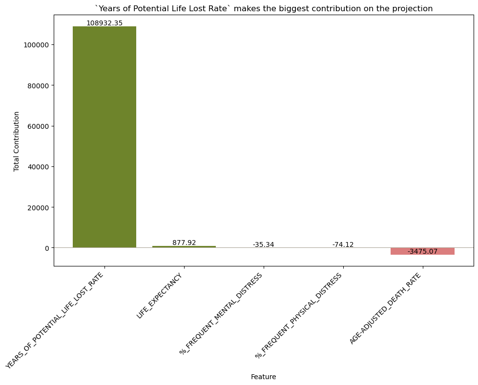
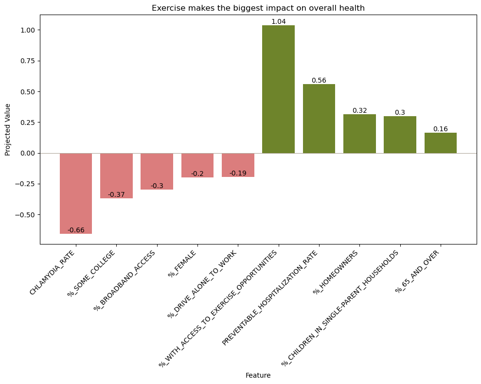
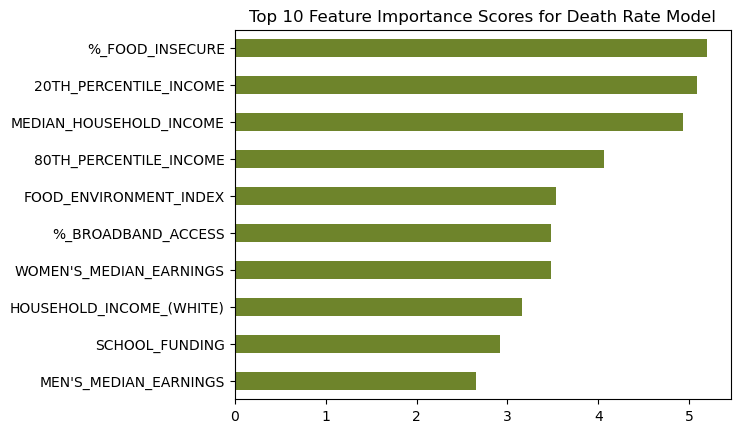
YEARS_OF_POTENTIAL_LIFE_LOST_RATEcontribued the most by a very large margin (see Figure 3). - Assess projection values of all other variables through a very similar process as the above point. We removed the selected columns first, then multiplied the corresponding first eigenvalues by the mean value of each other variable. We plotted the five variables contributing the most and least to the projection (see Figure 4).
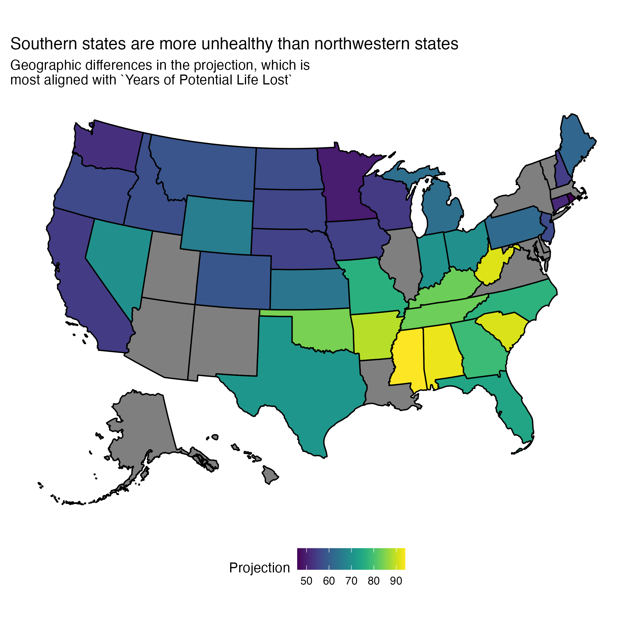
- Assess projection value by county in a very similar manner as above. We then averaged and mapped by state to visualize a geographic trend with our engineered health metric. We used Python for the projection analysis and R for the visualization See Figure 5 for the map and the below section for the map code.
- Assess contribution of each health variable by multiplying the corresponding element from the first eigenvalue by each of the selected columns and then summing each columns’ products.
# Extract the PCA components
pca_components = pca_all['pca'].components_

# Get the first eigenvalue component
first_eigenvalue_component = pca_components[0]

# Select the columns to project
columns_to_project = ['YEARS_OF_POTENTIAL_LIFE_LOST_RATE','LIFE_EXPECTANCY', 'AGE-ADJUSTED_DEATH_RATE', '%_FREQUENT_PHYSICAL_DISTRESS', '%_FREQUENT_MENTAL_DISTRESS']

# Calculate the contribution of each variable to the projection
contributions = selected_columns.multiply(first_eigenvalue_component[:len(columns_to_project)], axis=1)

# Sum the contributions for each variable across all data points
total_contributions = contributions.sum()

# Create a DataFrame for visualization
contributions_df = pd.DataFrame({
    'Feature': columns_to_project,
    'TotalContribution': total_contributions
})# Read in the data from python
st = read_csv("mean_projection_state.csv")
# Read in the state data from an installed package
states <- usmap::us_map()
# Merge the datasets
states = states %>%
mutate(state_name = full)%>%
left_join(st)
# Map
state_projection = states %>%
ggplot(aes(x,y,group=group)) +
geom_polygon(aes(fill = Projection), color = "black") +
theme_classic() +
coord_fixed()+
scale_fill_viridis()+
labs(subtitle = "Geographic differences in the first principle component, which is\nmost aligned with `Years of Potential Life Lost`",
title="Southern states are more unhealthy than northwestern states") +
theme(legend.position = "bottom") +
theme(
axis.text =element_blank(),
axis.title = element_blank(),
axis.ticks = element_blank(),
axis.line = element_blank(),
panel.background = element_rect(fill='transparent'),
plot.background = element_rect(fill='transparent', color=NA),
legend.background = element_rect(fill='transparent')
)Data Preprocessing Tools
| Name | Explaination |
|---|---|
| Standard Scaler | Standard Scaler is a tool you can use in machine learning to standardize all numeric inputs so the model can correctly assess the impact of each value. |
| One Hot Encoder | Similar to Standard Scaler, One Hot Encoder is a method use to convert character data to numeric in a standardized way so the model can weigh the impact of character input along with numeric. |
Unsupervised Dimension Reduction Model
| Name | Explaination |
|---|---|
| PCA | Principle Component Analysis (PCA) is a method of reducing the number of variables in a model by combining them into the principle components that describe the most variance in a given dataset. |
4.2 Analyzing Impact of Access to Care on Health Metrics
We used both R and Python to analyze how access to care impacts important health metrics.
4.2.1 Statistics in R
flowchart TD
  A(1. Create Dataset) --> B(2. Scale Dataset)
  B --> C(3. LM Model, reduce data \nto best features)
  C --> D(4. KM Curves \n for Life Expectancy features)
  D --> E(5. Log Rank Test \n for KM curves)
- Create our desired dataframe by reading in data from our remote database and joining where necessary.
- Preprocess:
- Selected preventative health measures of interest.
- Create distribution plots for variables of interest. Take natural log if skew was obvious (income data).
- Create Model
- Multiple Linear Mixed Model in R using selected variables. Created lm models for life expectancy, infant mortality, and age-adjusted death rate.
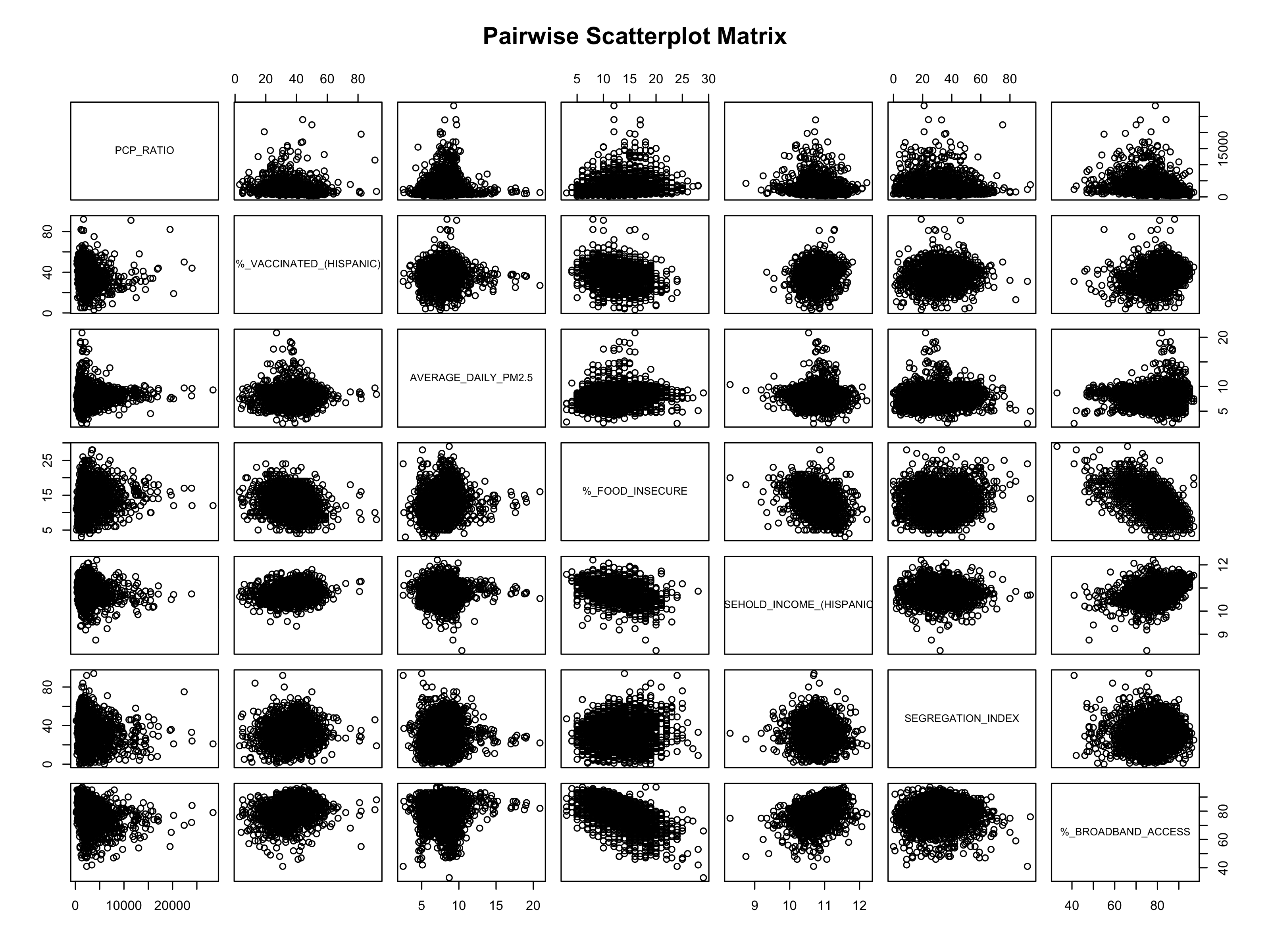
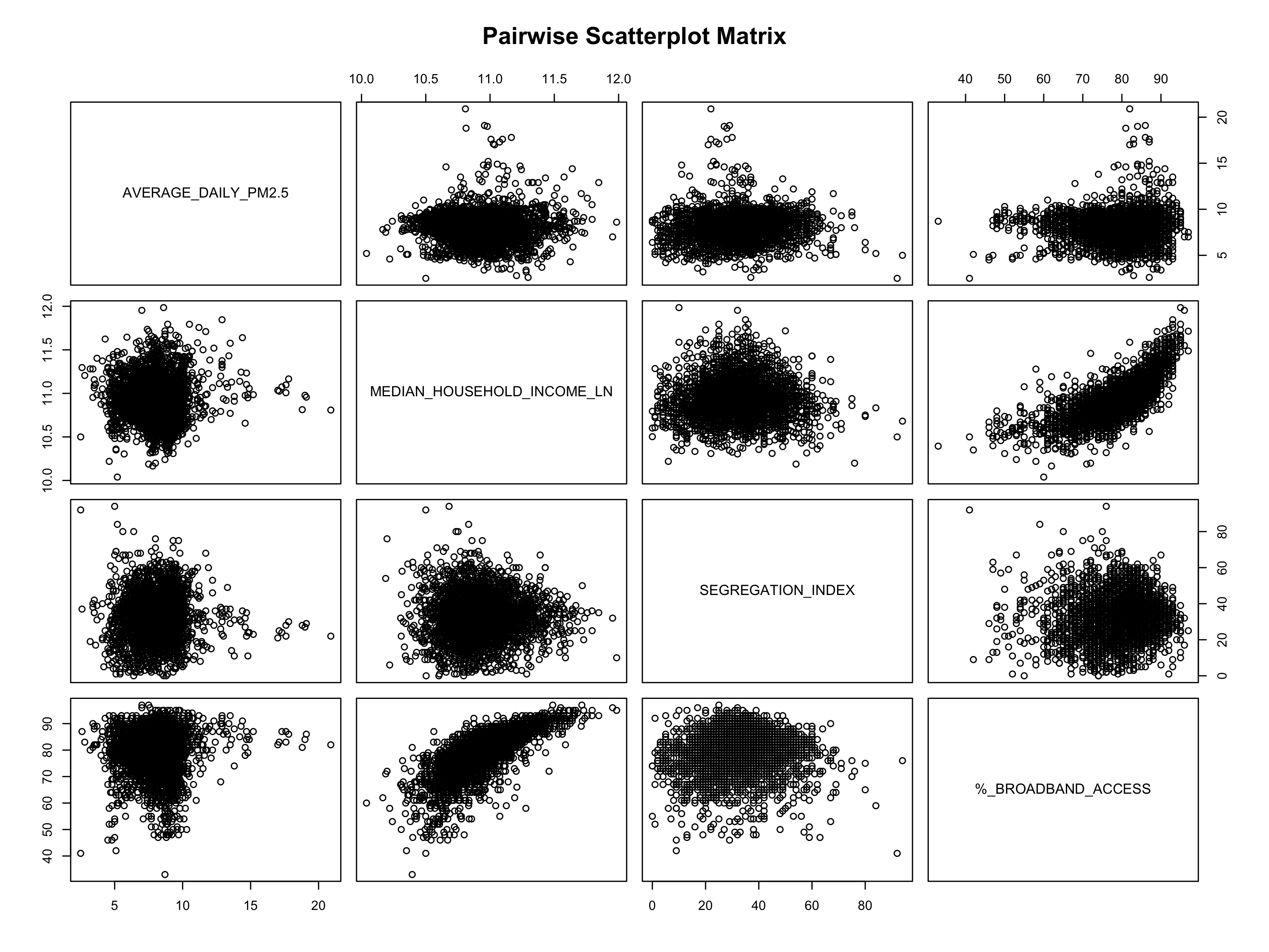
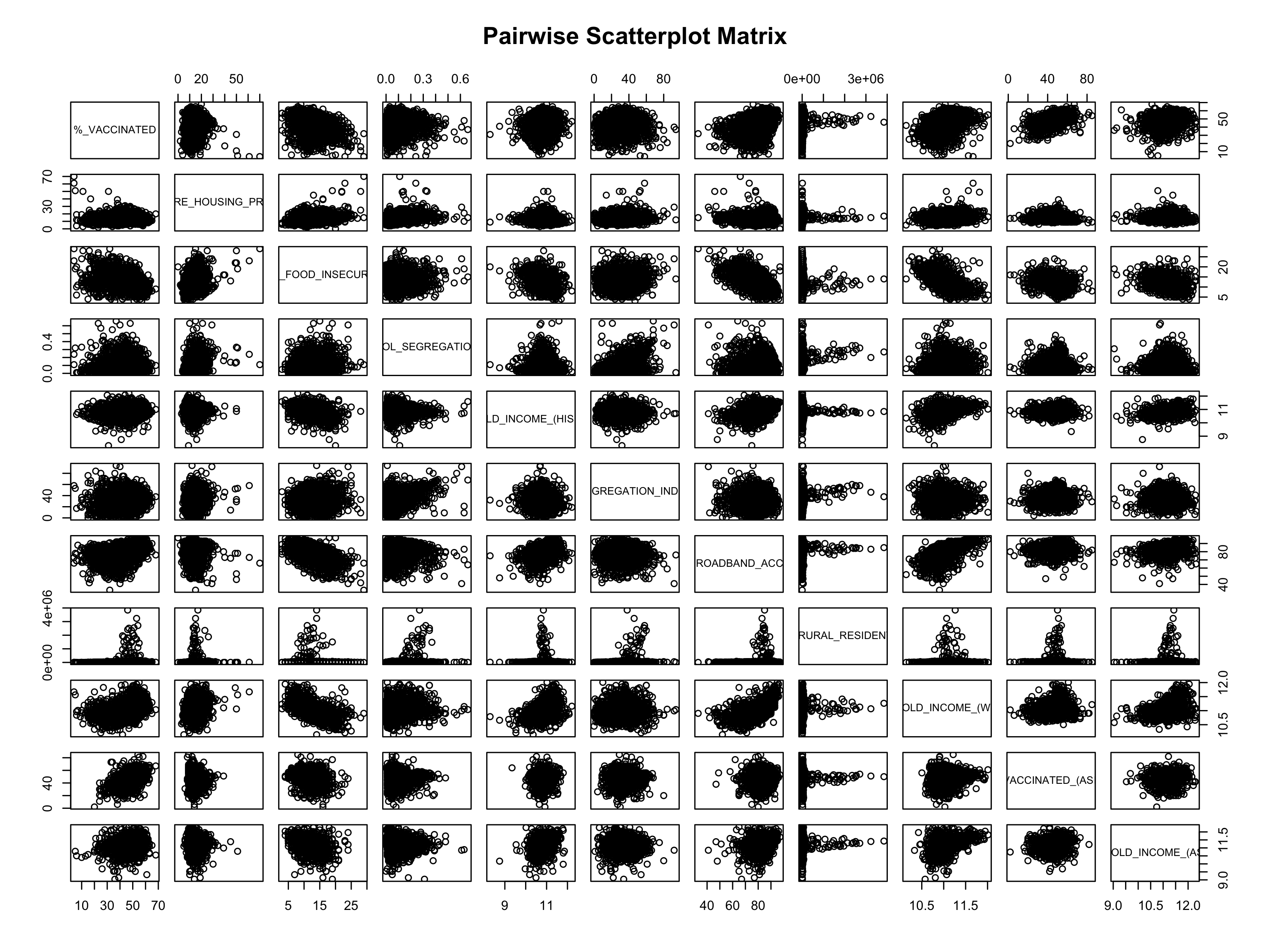
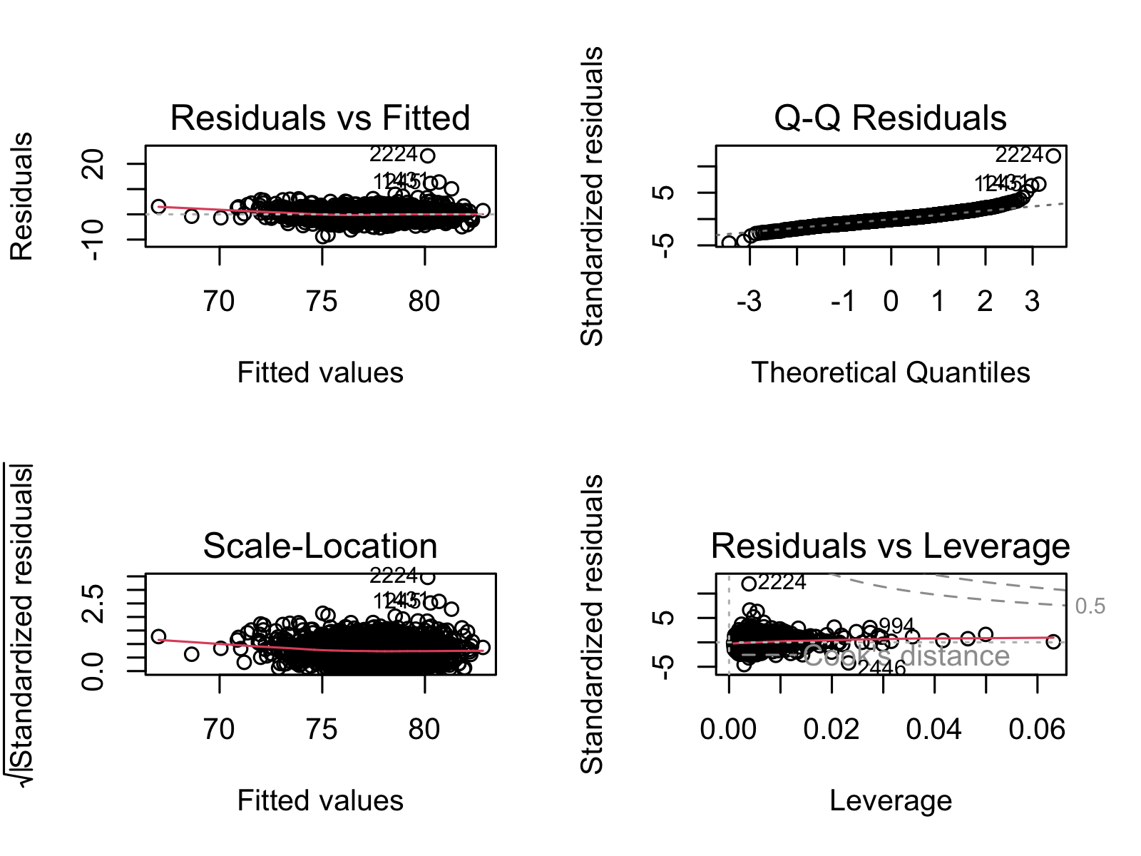
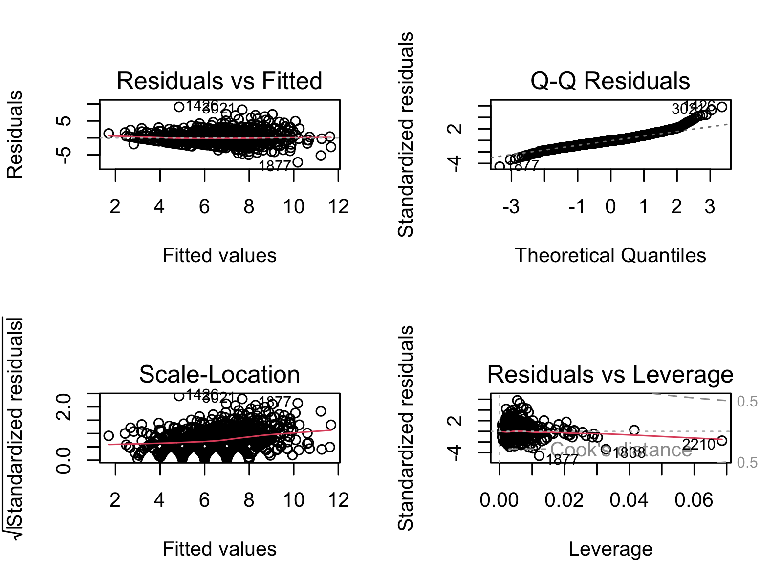
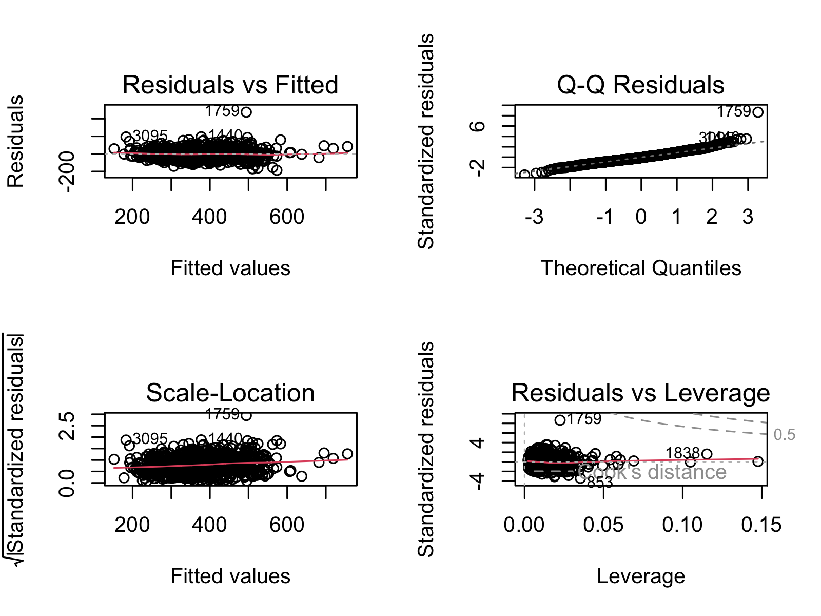
- Select signficant features for each, and recreate model with signfiicant features. Ensure no multicollinearity existed between remaining variables (see Figures S.4a through S.5C).
- Check to see if significance changes after recreating the model.
- Check directions of significance and double check variables have enough data points.
- Kaplan-Meier Curves for Life Expectancy
- Break up each significant predictive variable from above into quartiles.
- Create KM curves.
- Run log rank test to determine if there were significant differences between the quartiles.
| Test | Description |
|---|---|
| Kaplan-Meier Curve | A Kaplan-Meier (KM) curve is a display of survival data over time and across groups. |
| Log Rank Test | A log rank test is used to determine if the groups in a KM curve are significant. |
| Linear Regression | Linear regression is a statistical test used to find and quanitfy linear trends between data. |
4.2.2 Machine Learning in Python
flowchart TD
  A(1. Create Dataset) --> B(2. Scale Dataset)
  B --> C(3. KMeans, reduce data \nto best features)
  C --> D(4. Preprocess reduced dataset)
  D --> E(5. Model- Ensemble then \nselect best one)
  E --> F(6. Hyperparameterize, train, test model)
  F --> G(6. Add PCA to finalized pipeline)
- Create our desired dataframe by reading in data from our remote database and joining where necessary.
- Preprocess:
- Drop NAs while optimizing data frame size via trial and error.
- Use StandardScaler and OneHotEncoder tools from sklearn to transform our numeric and categorical data, respectively.
- Use KMeans to find the top 10 features from each model. (See Figures 9, and 12). Combine these variables with significant variables from the linear regression models completed in R.
- Continue preprocessing with the reduced dataset (using only variables from step 3)
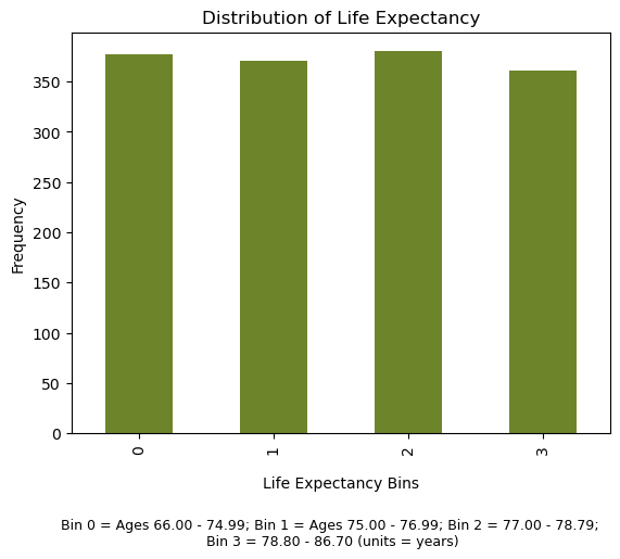
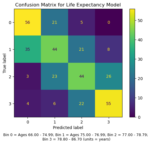
- Bin and modify data as necessary. This ensured equal representation across classes for each predicted y variable. A. In order to use classification tools such as RandomForestClassifier or GradientBoostingClassifier, we binned all our data by quartiles before running it through our models. B. For life expectancy, we dropped outliers first (ages below 60 and above 90, see Supplemental Figure 1).
- Train/test split dataset
- Create model
- Use LogisticRegression, RandomForestClassifier, GradientBoostingClassifier, CategoricalNaiveBayes, and Ensemble. Find which model performs the best.
- Hyperparameterize the model that works best from step 5i.
- Cross validate finalized model
- Test on testing data to find true accuracy
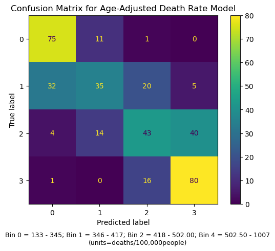
- Confusion matrix to see what went wrong (see Supplemental Figures 2A and 2B).
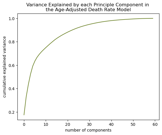
- Add PCA to the model
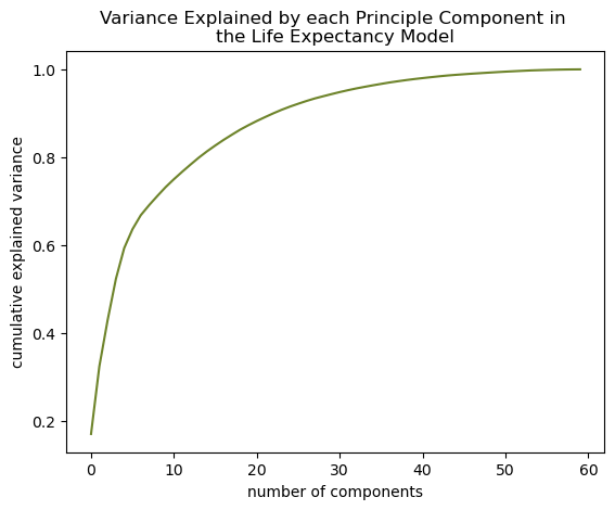
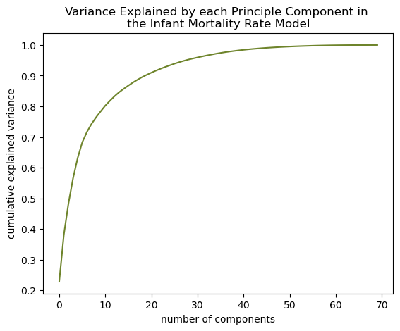
- Determine how many components explain 90% variance in the model (see Supplemental Figures 3A, 3B, and 3C).
- Add PCA with that number of components to the optimized pipeline made from Step 5.
Model Optimization Tools
| Name | Explaination |
|---|---|
| K-Best Feature Selection | K-Best feature selection is a tool used in machine learning used to find which variables in a given model most contribute to its prediction accuracy. |
| Confusion Matrices | Confusion matrices are plots of the true and predicted values of a given model and are used to determine where a model is succeeding and/or failing. |
Supervised Classification Models
| Name | Explaination |
|---|---|
| Random Forests | Random Forests randomly distribute the data given to it into multiple “trees” and averages the outcome from each tree to come to its final result. |
| Naive Bayes | Naive Bayes uses probability to find the most likely outcome. |
| Logistic Regression | Logisitic regression finds the linear regression of the log odds of the predictor variables to predict a binary outcome. |
| Gradient Boosting | Rather than creating lots of uncorrelated models like Random Forest, Gradient Boosting fits many models where each successive one corrects upon where the previous one was wrong. |
| Ensemble | Ensemble models combine many user-specified models and comes to its final outcome by averaging the individual outcomes of each model made up within it. |
Unsupervised Clustering Models
| Name | Explaination |
|---|---|
| K-Means | K-Means is a clustering method that attempts to divide up the data into a specified number of groups based on how close each data point is to each other. |
| Gaussian Mixture Model | Gaussian Mixture Model is another clustering method that assumes a specificed number of normally distributed clusters and assigns data points to the normal curve they best fit. |
4.3 Important Note!
We were wary of furthering the gap between classes, races, and/or genders. Often, those in lower socioeconomic status tend to have lower quality of health and less access to affordable healthcare. Our goal was not to perpetuate this gap but to find potential solutions for these underserved populations. We also recognized that our datasets were incomplete and that we were not be able to represent everyone’s needs. Those who are not using well-known forms of insurance, such as Direct Primary Care, or who are not seeking traditional medical care are not represented.
5 Results
5.1 Creating an Overall Health Quality Variable
As a novel way of assessing quality of health, we created a new variable to represent the overall health of a population. We knew that the following variables should be included in the creation of this new variable: LIFE_EXPECTANCY, AGE_ADJUSTED_DEATH_RATE, YEARS_OF_POTENTIAL_LIFE_LOST_RATE, %_FREQUENT_PHYSICAL_DISTRESS, and %_FREQUENT_MENTAL_DISTRESS. Reasons for choosing these variables is explained in Section 4.1.2. A clear linear relationship is seen between each of these metrics was observed (see Figure 2).
We projected these variables onto the first eigenvalue and assessed the contribution of each onto the projection. This was necessary to better interpret later analyses. We found that YEARS_OF_POTENTIAL_LIFE_LOST_RATE contributed to the projection by a large amount (see Figure 3), which suggested that further analyses represented YEARS_OF_POTENTIAL_LIFE_LOST_RATE far more than the other four variables.
YEARS_OF_POTENTIAL_LIFE_LOST_RATE made the most contribution by a very far margin. This suggests that further analyses represent YEARS_OF_POTENTIAL_LIFE_LOST_RATE far more than the other four variables.Next, we repeated a similar process as above to discover how much all the other variables were associated with the projection. We found the percent of population with access to exercise is most associated with the projection and chlamydia rate the least (see Figure 4). Other variables that were highly associated with the projection were preventable hospitalization rates (rate of Medicare enrollees being discharged from out-patient services), percent of homeowners, percent of kids in single-parent homes, and percent of people 65 years old or older. Since the projection is most explained by YEARS_OF_POTENTIAL_LIFE_LOST_RATE, this graph suggests that having access to exercise is most associated with variations in this metric. Further analysis needs to be done to confirm if a causal relationship exists between these two variables, and if so, in which directions.
CHLAMYDIA_RATE the least. Since the projection is most described byYEARS_OF_POTENTIAL_LIFE_LOST_RATE, that means access to exercise and chlamydia rate are associated with variations in this mortality metric the most and least, respectively.Finally, we determined the projection values for each state (see Figure 5). We found a clear geographic trend, where southeastern states have higher projection trends. Since the projection is most explained by YEARS_OF_POTENTIAL_LIFE_LOST_RATE, this data suggests southeastern states have higher rates than northwestern. Again, PCA cannot make causal claims, but only suggest associations, so Section 5.2 was done to determine the extent of these relationships.
5.2 Analyzing Impact of Access to Care on Health Metrics
In order to evaluate the health status of a group of people, we turned to three common metrics for doing so: life expectancy, mortality, and infant mortality.⁸ In the following sections, we modeled each of these by a list of variables representing access to care (see Section 8.1.2) and ensured there was not multicollinearity between the remaining variables and that model assumptions were met (see Figures S.4A through S.5C). Our goal was to determine how access to care impacted each of these three health metrics.
5.2.1 Life Expectancy
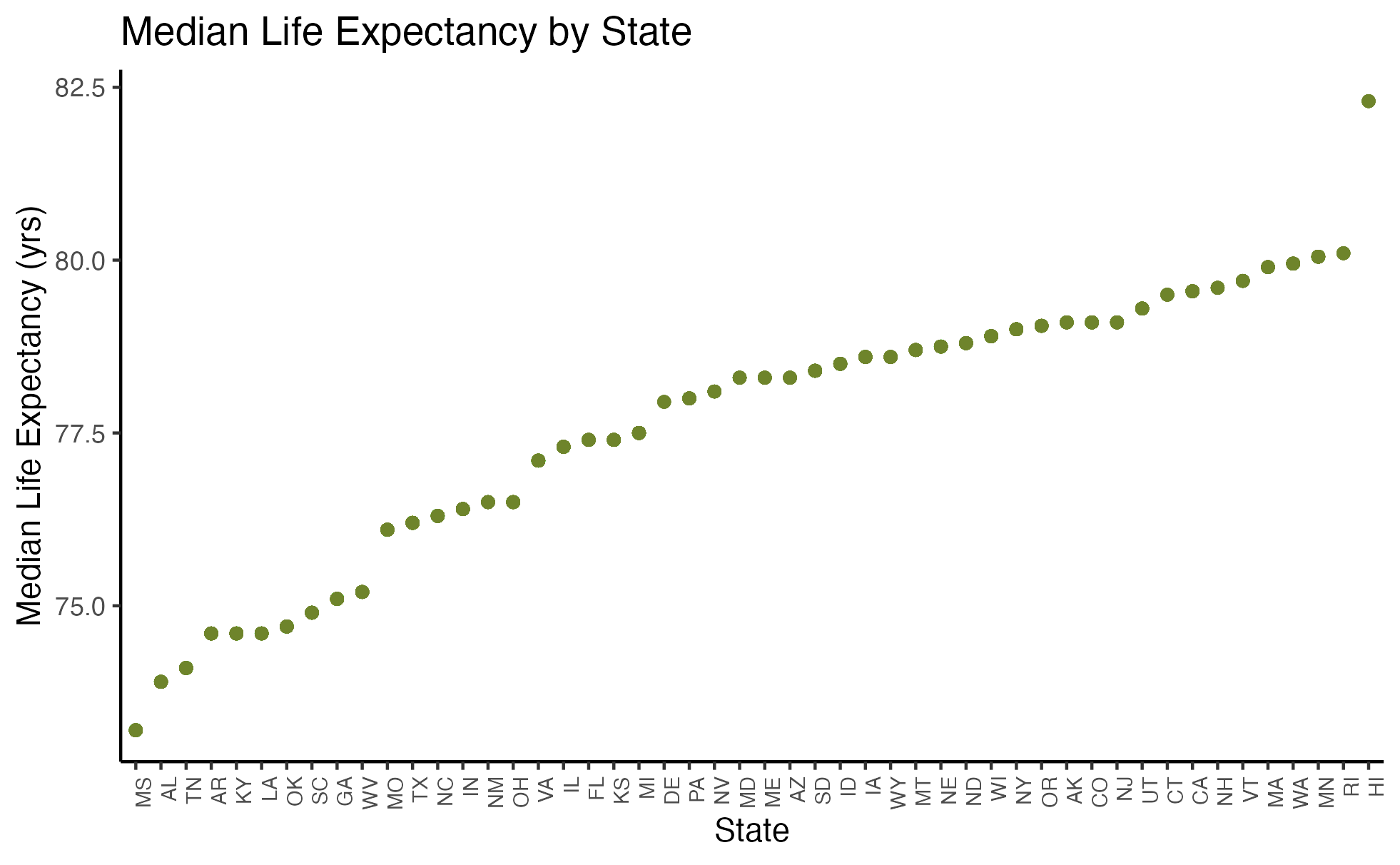
Before doing any regression analysis, we were curious about the relationship between median life expectancy and state. Figure 6 demonstrates this relationship and reveals a clear linear association.
When building our linear model, we narrowed down our variables to just those that significantly impacted life expectancy. We ensured the remaining variables did not exhibit multicollinearity (see Figures S.4A and S.5A). Equation 1 shows our final model and Section 8.1.3 our coefficient table for preventative healthcare measures and life expectancy. We found that Primary Care Physician (PCP) Ratio and Percentage of Access to Broadband Internet were both positively correlated with life expectancy, whereas Percentage of Food Insecurity and Segregation Index were negatively correlated with life expectancy.
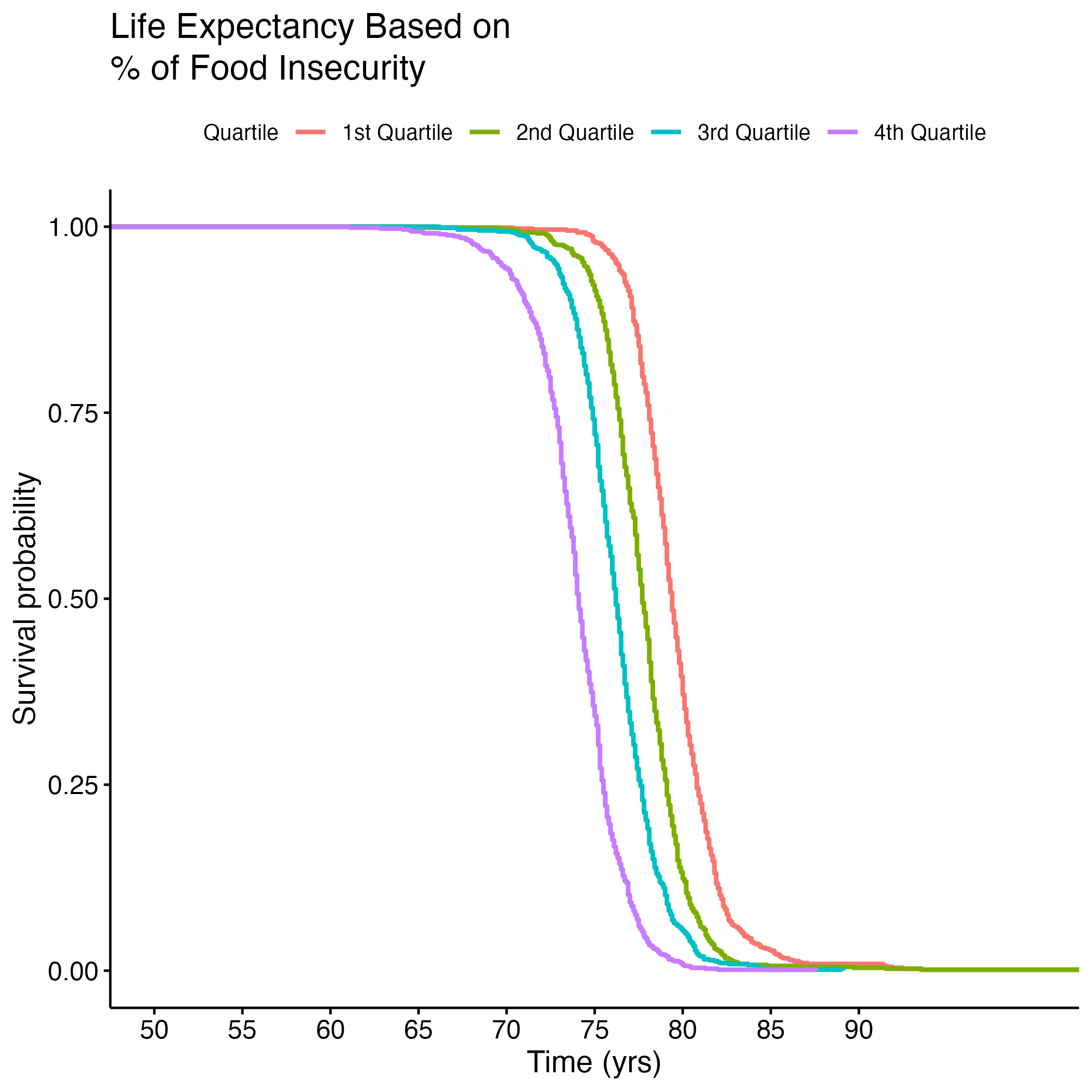
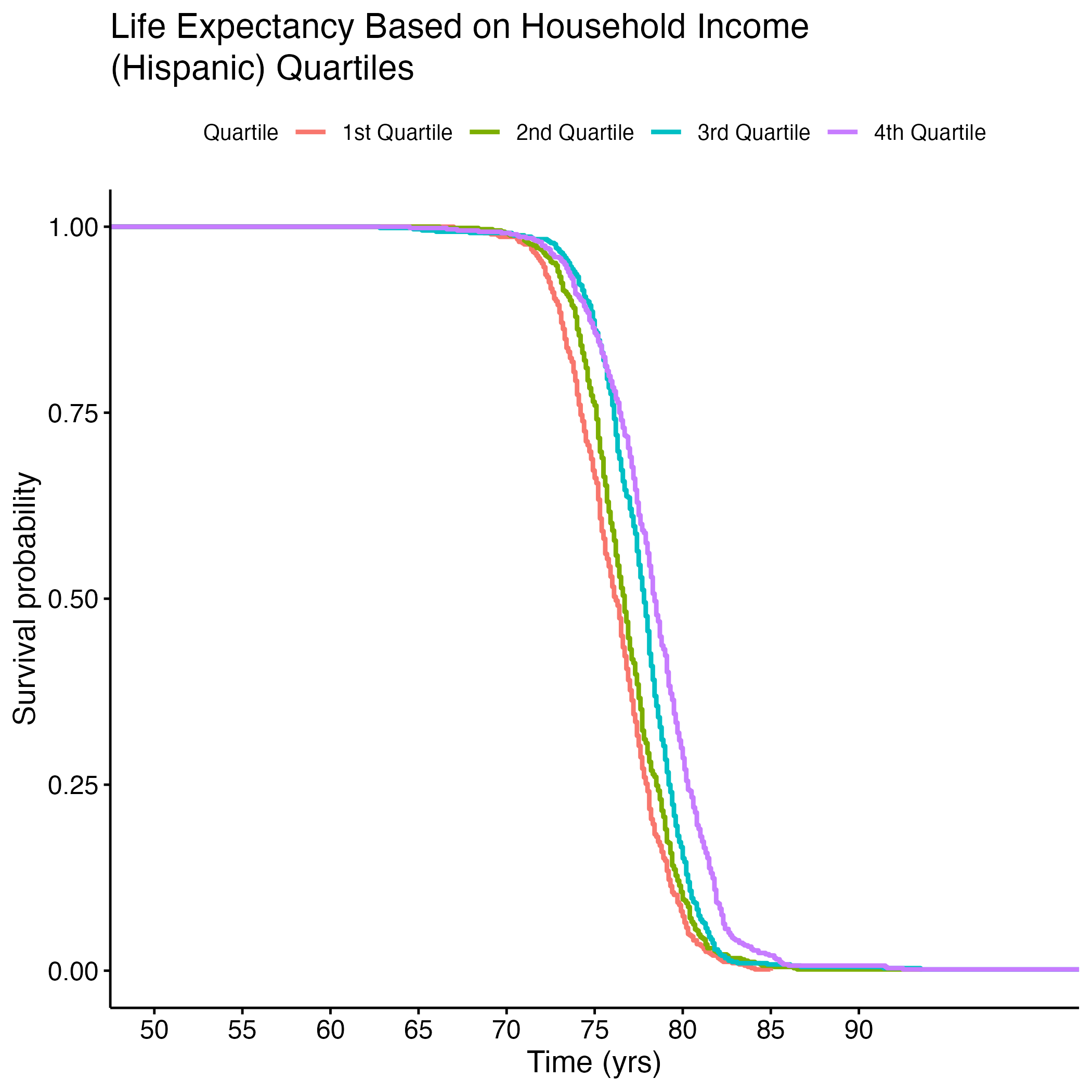
To better understand the survival (life expectancy) of different groups for each of these signficant variables, we created Kaplan-Meier (KM) Curves and we plotted each variable by quartile. We then conducted a log rank test to compare across quartiles to see if they were significantly different. Figure 7 shows life expectancy based on the quartile of food insecurity.
Table 1 shows the results of the log rank test (which are significant, as p = <2e-16 (not shown here)). Quartiles 1 and 2 (less food insecurity) observed less death than expected, but quartiles 3 and 4 (more food insecurity) observed more death than expected. This demonstrates that there exits a significant difference between life expectancy of people in the lower versus the higher quantiles of food insecurity.
| Quartile | N | Observed | Expected | (O-E)^2/E | (O-E)^2/V |
|---|---|---|---|---|---|
| quartile=1 | 704 | 704 | 505 | 78.411 | 98.013 |
| quartile=2 | 760 | 760 | 584 | 52.895 | 68.550 |
| quartile=3 | 757 | 757 | 745 | 0.184 | 0.254 |
| quartile=4 | 749 | 749 | 1135 | 131.551 | 230.098 |
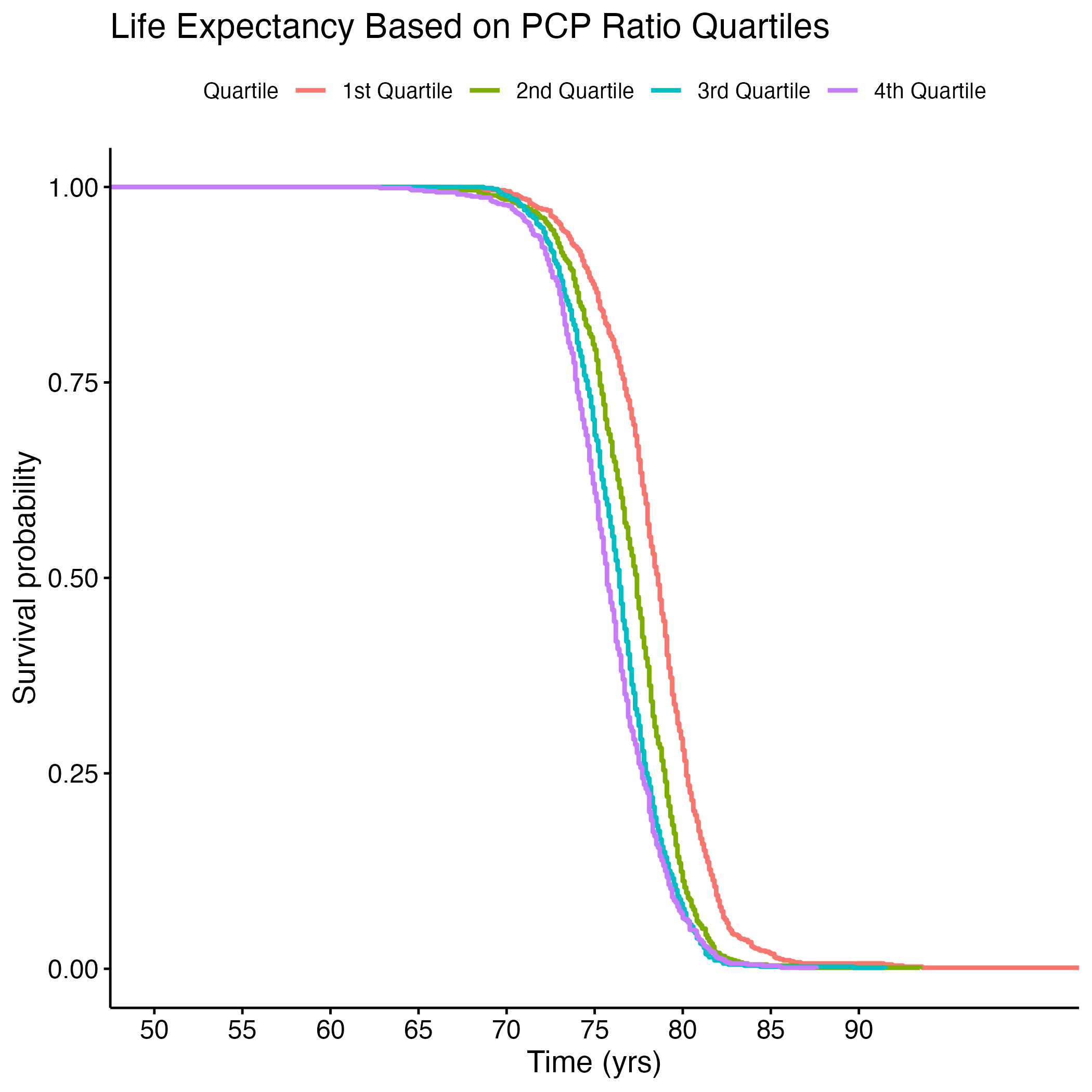
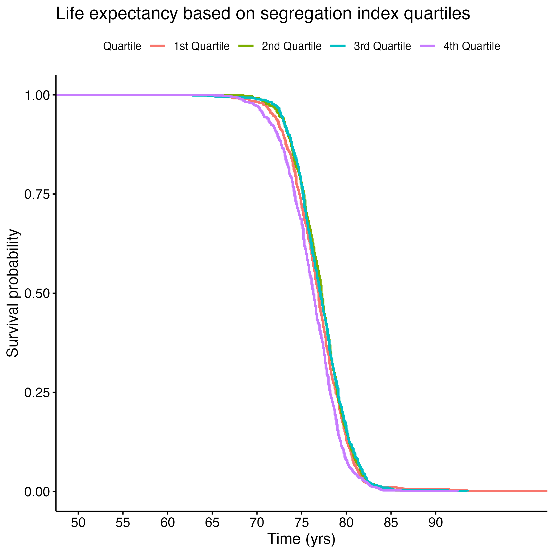
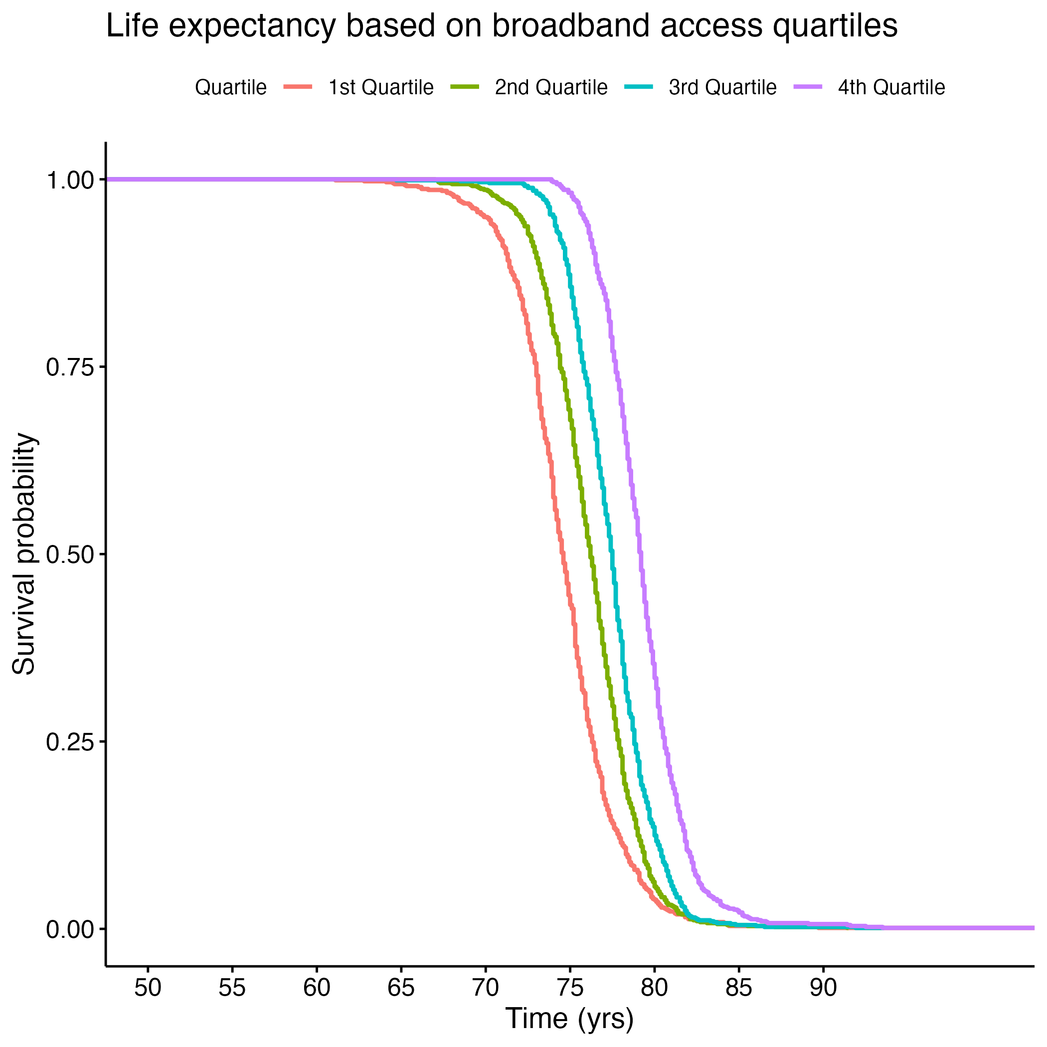
Additional Kaplan-Meier Curves for life expectancy were made for the following variables: PCP Ratio, Segregation Index, and Percentage of Broadband Internet Access. Log rank tests were performed for each, and all of the overall results were significant (see Section 8.1.6 through Section 8.1.13). There were significant differences between each quartile in the PCP Ratio and Percentage of Broadband Internet Access plots, but the fourth quartile from the Segregation Index was the only one that was significantly different from the rest. Figure 8 shows each of the KM curves. These results suggest that lower access to care (PCP Ratio and Percentage of Broadband Internet Access) and the most segregated areas (fourth quartile of Segregation Index) have lower life expectancies. The rest of the KM curves can be found in section here: S.6a through S.6E.
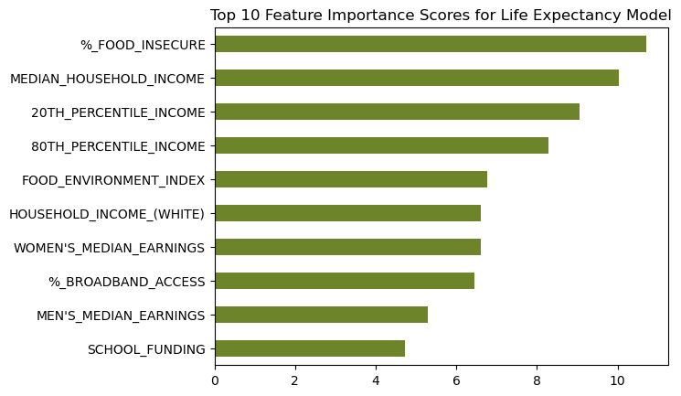
We then used machine learning algorithms to predict life expectancy of individuals based on these significant covariates along with the top ten features found through KBest (see Figure 9). It is important to note that a lot of features were found in both the linear regression model explained above and in the KBest result.
Our model predicted life expectancy based only on the fifteen significant access-to-care-related variables with 68% accuracy! This means that 68% of an individual’s life expectancy can be predicted or explained by only thirteen items- all of which relate to one’s access to care and basic needs. Only the remaining 32% can be explained by all other factors in a person’s life. This underscores the importance of having access to healthcare, healthy foods, and other basic necessities.
5.2.2 Infant Mortality
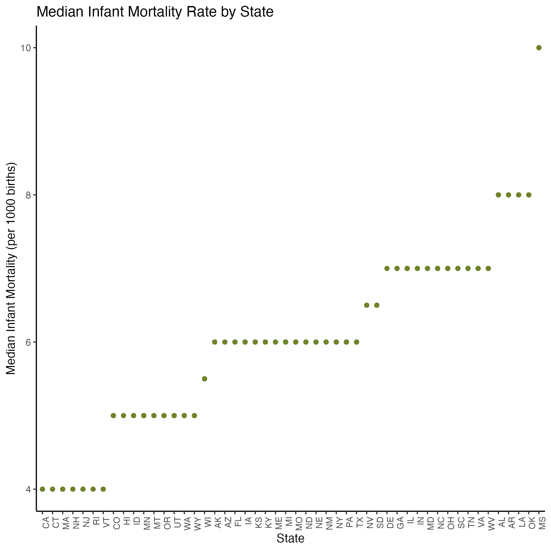
Figure 10 shows the median infant mortality rates between states. Note that the chart appears to “stair-step” as infant mortality rates are represented as integers rather than continuous numbers. Because of the observed positive associaiton, we included the variable in our linear model to determine which states were significantly correlated with infant mortality.
In our statistical model of preventative healthcare measures and infant mortality (see Equation 2 and Section 8.1.4), we found that Median Household Income and Broadband Internet Access were significantly correlated in the negative direction with infant mortality rates. That is, as income and access to the Internet increased, infant mortality rates decreased. The Segregation Index coefficient shows that as segregation increases, infant mortality rates increase as well. (See Figures S.4a and S.5B for our pairwise and assumption plots, which show that the variables we kept in our model were not correlated with each other.)
On the machine learning side, we repeated the same process for infant mortality rate as for life expectancy, but got a low accuracy score of 36% due to the high number of NAs in our Infant Mortality Rate column. Future analyses would do well to increase record-keeping of infant mortality rates by county as the metric “indicates the current health status of a population and reflects the overall state of maternal health, as well as the quality and accessibility of primary health care available to pregnant women and infants.”⁸
5.2.3 Age Adjusted Death Rate
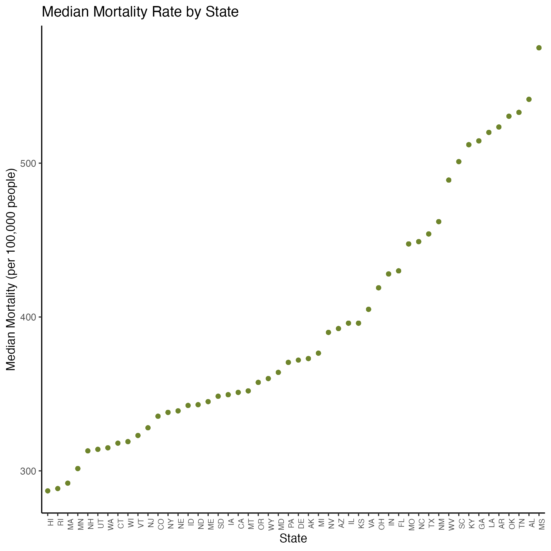
Figure 11 shows median age-adjusted death rate by state, with Hawaii having the lowest rate and Mississippi having the highest. Age-adjusted death rate (mortality rate) appeared to vary across states as seen in Figure 4A, so we again kept state in our linear model.
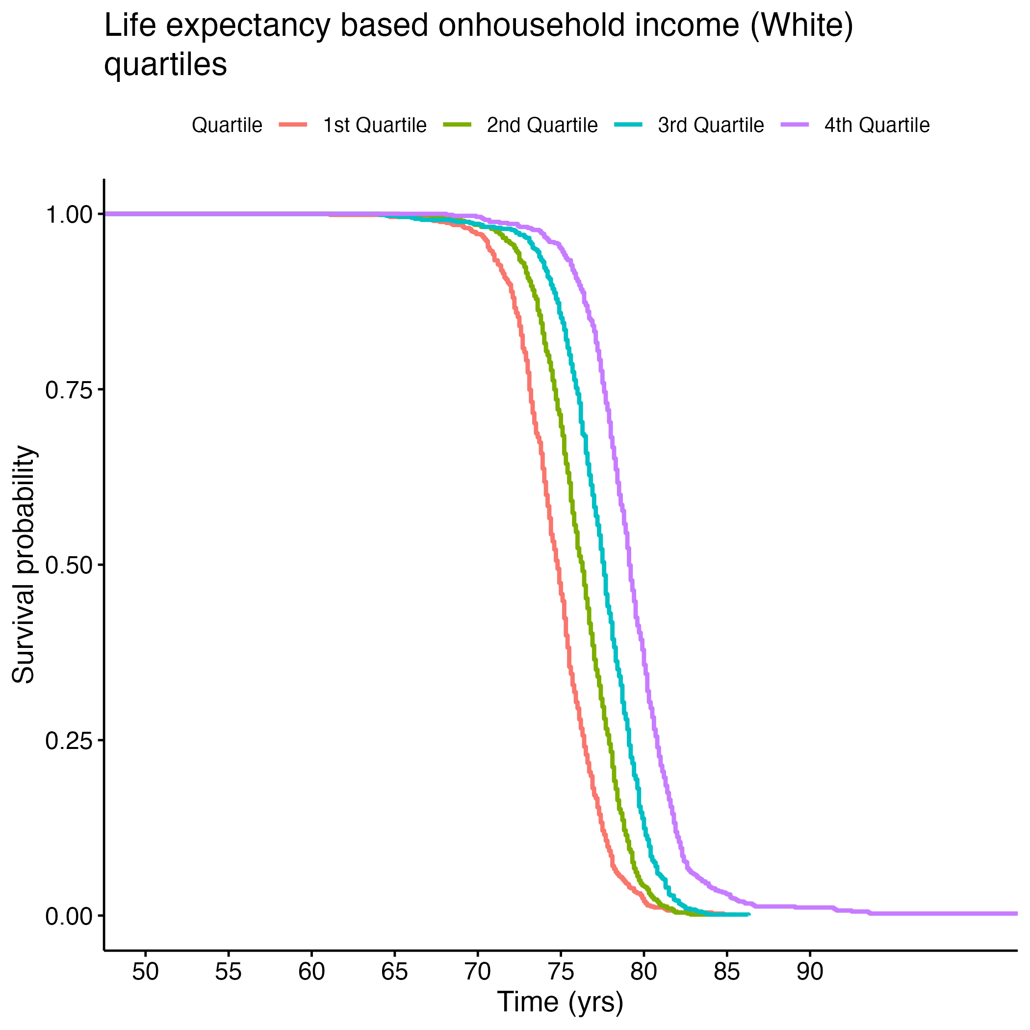
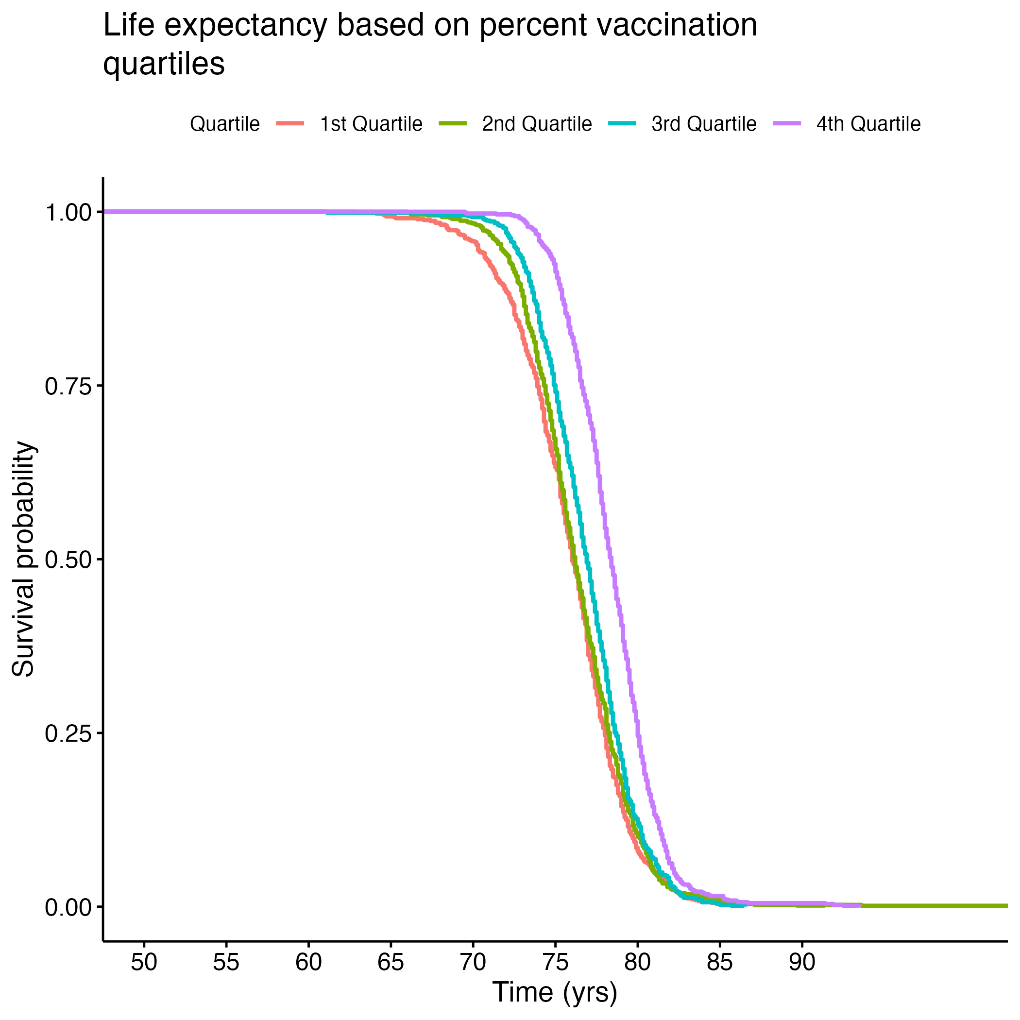
In our statistical model of preventative healthcare measures and mortality (see Equation 3 and Section 8.1.5), we found that as food insecurity, segregation, and school segregation increased, mortality rates increased as well. As broadband internet access, vaccination, and number of rural residents increased, mortality rates decreased.
Looking at demographics, we noticed as income increased among white Americans, mortality rates decreased. This income trend was the opposite among Asian (not significant) and Hispanic Americans (significant). Looking closer at the income correlation plots, the trends for Asian and Hispanic Americans appear to have more data points that could be considered outliers. As the percentage of severe housing issues increased, the mortality rate decreased, but the correlation plot appears to have outliers that could be skewing this trend as well. (See Figures S.4C and S.5C for our pairwise and assumption plots, which show that the variables we kept in our model were not correlated with each other.)
Finally, we repeated our machine learning process to predict age-adjusted death rate based on our significant access to care covariates. Our model accurately predicted the binned death rate for 63% of our test data. Just sixteen access-to-care-related covariates predicted mortality rate 63% of the time! This again emphasizes the importance of access to care and basic needs in one’s overall health status.
5.2.4 State Congruence for All Health Measures
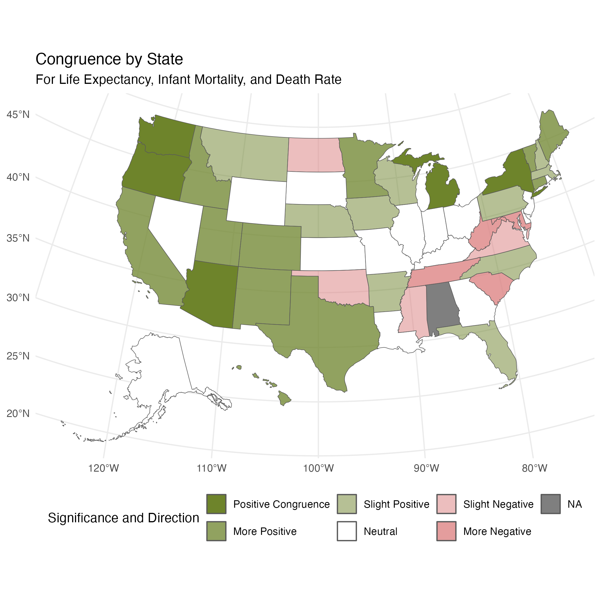
When creating our individual linear mixed models, we found that some states had significant impacts on the health measures (life expectancy, infant mortality, and mortaltiy). We were curious if states were showing congruent signficance. For example, if Oregon had significantly higher life expectancy, did it also have significantly lower infant mortality and mortality? To explore this we created Figure 13, which shows positive outcomes in green and negative outcomes in red, with color intensity indicating congruence. Life expectancy was adjusted since it is considered positive, while infant mortality and mortality are considered negative. “Congruence” means that the state was significant for all 3 variables.”More” means that the state was negatively/positively significant for 2/3 variables, “Slight” means the state was negatively/positively significant for 1/3, and “Neutral” means the state was not significant for any variables. Once again, the northwestern states emerge as healthier across all metrics when compared to the southeastern states.
6 Conclusions
Our analysis showed significant correlations between various socio-economic factors and key health outcomes such as life expectancy, infant mortality, and age-adjusted death rate. When assessing overall health, years of potential life lost had the biggest impact, suggesting variations in this variable influenced our holistic view of health the most. This implies our data had a large differences in this mortality metric across communities, where some areas are dying earlier than would otherwise be predicted.
Throughout our analysis, the southern states continually showed to have worse health outcomes than the northwestern states. Lower income areas, communities with greater segregation between races, and food deserts all had low health metrics. Future public health work should focus on builidng infrastructure and increasing access to care and other basic needs in these areas.
Specifically, broadband internet access, food security, income, rate of PCPs, and exercise opportunities emerged as crucial necessities for improving health. Since reduced access to these items (particularly internet access, exercise opportunities, and available providers) are correlated with lower health metrics, it suggests a lower health literacy may also exist in these areas. Especially where internet access is low, increasing opportunities to learn about health and science through school and community programs may also provide benefits in improving the overall health of these communities.
While we observed meaningful correlations, certain findings were limited by missing data, particularly regarding infant mortality rate. We were also limited by the low consistency in CHRR data across years, which led us to doubt we could find an accurate year-to-year comparison. KFF data was only available on the state-level, so further refining it by county would greatly improve the accuracy of our findings.
Future analysis would benefit from comparing year over year with more consistent data, measuring across income groups to see which healthcare measures are most important for each socioeconomic group, and investigating how preventative care measures in particular impact health.
Overall, our comprehensive analysis confirms the critical role of socioeconomic factors, healthcare availability and literacy, and basic need access in determining health outcomes.
7 References
- AAFP. (n.d.). Direct Primary Care. AAFP. https://www.aafp.org/family-physician/practice-and-career/delivery-payment-models/direct-primary-care.html
- American Hospital Association. (n.d.). Infographic: Medicare Significantly Underpays Hospitals for Cost of Patient Care. American Hospital Association. https://www.aha.org/2024-01-10-infographic-medicare-significantly-underpays-hospitals-cost-patient-care
- Broom, D. (2022, April 5). We’re spending more years in poor health than at any point in history. How can we change this? World Economic Forum. https://www.weforum.org/agenda/2022/04/longer-healthier-lives-everyone/#:~:text=Global%20Health,-Follow&text=Life%20expectancy%20is%20rising%2C%20but,six%20years%20of%20quality%20life.
- CMS. (2020). Race and ethnicity of the national Medicaid and CHIP population in 2020. CMS. https://www.medicaid.gov/medicaid/data-and-systems/downloads/macbis/2020-race-etncity-data-brf.pdf
- County Health Rankings & Roadmaps. (2024). Data & Documentation. County Health Rankings & Roadmaps. https://www.countyhealthrankings.org/health-data/methodology-and-sources/data-documentation
- DPC Frontier. (n.d.). Health Care Sharing Ministries. DPC Frontier. https://www.dpcfrontier.com/health-sharing-ministries
- DPC Nation. (n.d.). Join the Direct Primary Care revolution. DPC Nation. https://dpcnation.org/
- EPA. (2023, August 10). Health status. EPA. https://www.epa.gov/report-environment/health-status#:~:text=The%20health%20status%20of%20a,accessibility%20of%20health%20personnel%20and
- Galvani-Townsend, S., Martinez, I., & Pandey, A. (2022, Nov. 12). Is life expectancy higher in countries and territories with publicly funded health care? Global analysis of health care access and the social determinants of health. Journal of Global Health, 12(04091), 1-12. doi: 10.7189/jogh.12.04091
- Gunja, M.Z., Gumaz, E.D., & Williams, R.D.II. (2023, Jan. 31). U.S. Health Care from a Global Perspective, 2022: Accelerating Spending, Worsening Outcomes. The Commonwealth Fund. https://www.commonwealthfund.org/publications/issue-briefs/2023/jan/us-health-care-global-perspective-2022
- Harvard School of Public Health. (2022, December). Healthy longevity. The Nutrition Source. https://nutritionsource.hsph.harvard.edu/healthy-longevity/
- Hsiang, W.R., Lukasiewicz, A., Gentry, M., Kim, C., Leslie, M.P., Pelker, R., Forman, H.P. Wiznia, D.H. (2019, Apr. 5). Medicaid patients have greater difficulty scheduling health care appointments compared with private insurance patients: A meta-analysis. Inquiry: The Journal of Health Care Organization, Provision, and Financing, 56,(1-9). https://doi.org/10.1177/004695801983811
- KFF. (2024). State Health Facts: Build A Custom State Report. KFF: The independent source for health policy research, polling, and news. https://www.kff.org/statedata/custom/
- Woolf , S.H., Aron, L., Chapman, D.A., Dubay, L., Zimmerman, E., Snellings, L.C., Hall, L., Haley, A.D., Holla, N., Ayers, K., Lowenstein, C., & Waidmann, T.A. (2016). The health of the States: How U.S. States compare in health status and the factors that shape health. Virginia Commonwealth University Center on Society and Health. https://www.urban.org/sites/default/files/publication/85211/health-of-the-states_6.pdf
8 Supplemental Data
8.1 Supplemental Tables
8.1.1 S.Table 1: CSV containing all variables used to assess weight contribution to new variable
8.1.2 S.Table 2: CSV containing all variables used to assess access to care
8.1.3 S. Table 3: Coefficient Table of Life Expectancy Linear Model
| Predictor | Estimate | Std. Error | t value | Pr(>|t|) |
|---|---|---|---|---|
| (Intercept) | 7.092e+01 | 2.171e+00 | 32.661 | < 2e-16 *** |
PCP_RATIO |
1.076e-04 | 3.664e-05 | 2.935 | 0.00338 ** |
%_VACCINATED_(HISPANIC) |
-6.969e-03 | 5.291e-03 | -1.317 | 0.18802 |
AVERAGE_DAILY_PM2.5 |
-3.642e-02 | 2.558e-02 | -1.424 | 0.15471 |
%_FOOD_INSECURE |
-3.947e-01 | 2.030e-02 | -19.440 | < 2e-16 *** |
HOUSEHOLD_INCOME_(HISPANIC)_LN |
9.561e-02 | 1.897e-01 | 0.504 | 0.61427 |
SEGREGATION_INDEX |
-3.593e-02 | 4.618e-03 | -7.781 | 1.35e-14 *** |
%_BROADBAND_ACCESS |
1.175e-01 | 9.519e-03 | 12.340 | < 2e-16 *** |
8.1.4 S. Table 4: Coefficient Table of Infant Mortality Rate Linear Model
| Predictor | Estimate | Std. Error | t value | Pr(>|t|) |
|---|---|---|---|---|
| (Intercept) | 57.531253 | 2.427216 | 23.703 | < 2e-16 *** |
AVERAGE_DAILY_PM2.5 |
0.036263 | 0.023539 | 1.541 | 0.124 |
MEDIAN_HOUSEHOLD_INCOME_LN |
-4.134217 | 0.269866 | -15.320 | < 2e-16 *** |
SEGREGATION_INDEX |
0.032420 | 0.004514 | 7.182 | 1.19e-12 *** |
%_BROADBAND_ACCESS |
-0.058167 | 0.009648 | -6.029 | 2.19e-09 *** |
8.1.5 S. Table 5: Coefficient Table of Mortality Rate Linear Model
| Predictor | Estimate | Std. Error | t value | Pr(>|t|) |
|---|---|---|---|---|
| (Intercept) | 9.933e+02 | 1.443e+02 | 6.884 | 1.06e-11 *** |
%_VACCINATED |
-2.097e+00 | 3.655e-01 | -5.737 | 1.29e-08 *** |
%_SEVERE_HOUSING_PROBLEMS |
-3.190e+00 | 5.191e-01 | -6.145 | 1.18e-09 *** |
%_FOOD_INSECURE |
1.503e+01 | 9.902e-01 | 15.181 | < 2e-16 *** |
SCHOOL_SEGREGATION_IDX |
2.925e+01 | 3.784e+01 | 0.773 | 0.43979 |
HOUSEHOLD_INCOME_(HISPANIC)_LN |
1.999e+01 | 9.581e+00 | 2.086 | 0.03725 * |
SEGREGATION_INDEX |
1.275e+00 | 2.641e-01 | 4.827 | 1.61e-06 *** |
%_BROADBAND_ACCESS |
-5.696e+00 | 5.048e-01 | -11.284 | < 2e-16 *** |
#_RURAL_RESIDENTS |
-1.468e-05 | 5.814e-06 | -2.524 | 0.01175 * |
HOUSEHOLD_INCOME_(WHITE)_LN |
-5.001e+01 | 1.544e+01 | -3.239 | 0.00124 ** |
%_VACCINATED_(ASIAN) |
2.830e-01 | 2.432e-01 | 1.163 | 0.24498 |
HOUSEHOLD_INCOME_(ASIAN)_LN |
1.067e+01 | 6.013e+00 | 1.774 | 0.07641 . |
8.1.6 S. Table 6a: Log Rank Test Results for Food Insecurity KM Curve
| Quantile | N | Observed | Expected | (O-E)^2/E | (O-E)^2/V |
|---|---|---|---|---|---|
| quantile=1 | 779 | 779 | 1451 | 311.4 | 660.4 |
| quantile=2 | 777 | 777 | 880 | 12.0 | 17.3 |
| quantile=3 | 781 | 781 | 548 | 99.4 | 127.5 |
| quantile=4 | 786 | 786 | 245 | 1199.1 | 1414.8 |
8.1.7 S. Table 6b: Log Rank Test Results for PCP Ratio KM Curve
| Quantile | N | Observed | Expected | (O-E)^2/E | (O-E)^2/V |
|---|---|---|---|---|---|
| quantile=1 | 733 | 733 | 1122 | 135.0780 | 236.6866 |
| quantile=2 | 740 | 740 | 746 | 0.0479 | 0.0663 |
| quantile=3 | 743 | 743 | 574 | 49.7260 | 64.2851 |
| quantile=4 | 743 | 743 | 517 | 99.2125 | 125.0144 |
8.1.8 S. Table 6C: Log Rank Test Results Segregation Index KM Curve
| Quantile | N | Observed | Expected | (O-E)^2/E | (O-E)^2/V |
|---|---|---|---|---|---|
| quantile=1 | 726 | 726 | 725 | 3.95e-04 | 5.46e-04 |
| quantile=2 | 725 | 725 | 782 | 4.21e+00 | 5.95e+00 |
| quantile=3 | 725 | 725 | 792 | 5.66e+00 | 8.05e+00 |
| quantile=4 | 725 | 725 | 601 | 2.55e+01 | 3.33e+01 |
8.1.9 S. Table 6D: Log Rank Test Results Broadband Access KM Curve
| Quantile | N | Observed | Expected | (O-E)^2/E | (O-E)^2/V |
|---|---|---|---|---|---|
| quantile=1 | 775 | 775 | 373 | 433.06 | 517.44 |
| quantile=2 | 781 | 781 | 573 | 75.18 | 96.20 |
| quantile=3 | 787 | 787 | 819 | 1.28 | 1.79 |
| quantile=4 | 780 | 780 | 1357 | 245.50 | 476.83 |
8.1.10 S. Table 6E: Log Rank Test Results Household Income (Hispanic) KM Curve
| Quantile | N | Observed | Expected | (O-E)^2/E | (O-E)^2/V |
|---|---|---|---|---|---|
| quantile=1 | 589 | 589 | 402 | 87.38 | 109.78 |
| quantile=2 | 595 | 595 | 490 | 22.39 | 29.25 |
| quantile=3 | 596 | 596 | 641 | 3.16 | 4.49 |
| quantile=4 | 588 | 588 | 835 | 73.12 | 121.34 |
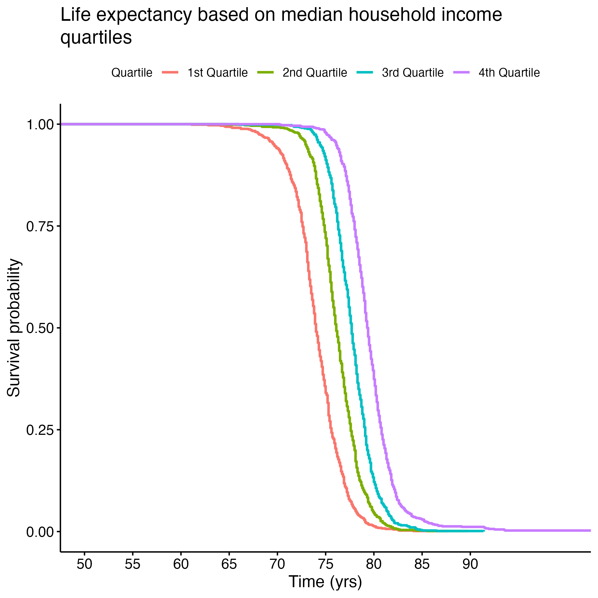
8.1.11 S. Table 6F: Log Rank Test Results Median Household Income KM Curve
| Quantile | N | Observed | Expected | (O-E)^2/E | (O-E)^2/V |
|---|---|---|---|---|---|
| quantile=1 | 779 | 779 | 262 | 1024.10 | 1199.8 |
| quantile=2 | 778 | 778 | 539 | 105.80 | 135.5 |
| quantile=3 | 781 | 781 | 874 | 9.94 | 14.3 |
| quantile=4 | 784 | 784 | 1447 | 303.86 | 643.3 |
8.1.12 S. Table 6G: Log Rank Test Results Percent Vaccination KM Curve
| Quantile | N | Observed | Expected | (O-E)^2/E | (O-E)^2/V |
|---|---|---|---|---|---|
| quantile=1 | 755 | 755 | 579 | 53.32 | 67.73 |
| quantile=2 | 779 | 779 | 654 | 23.71 | 31.10 |
| quantile=3 | 790 | 790 | 752 | 1.88 | 2.56 |
| quantile=4 | 786 | 786 | 1124 | 101.58 | 166.97 |
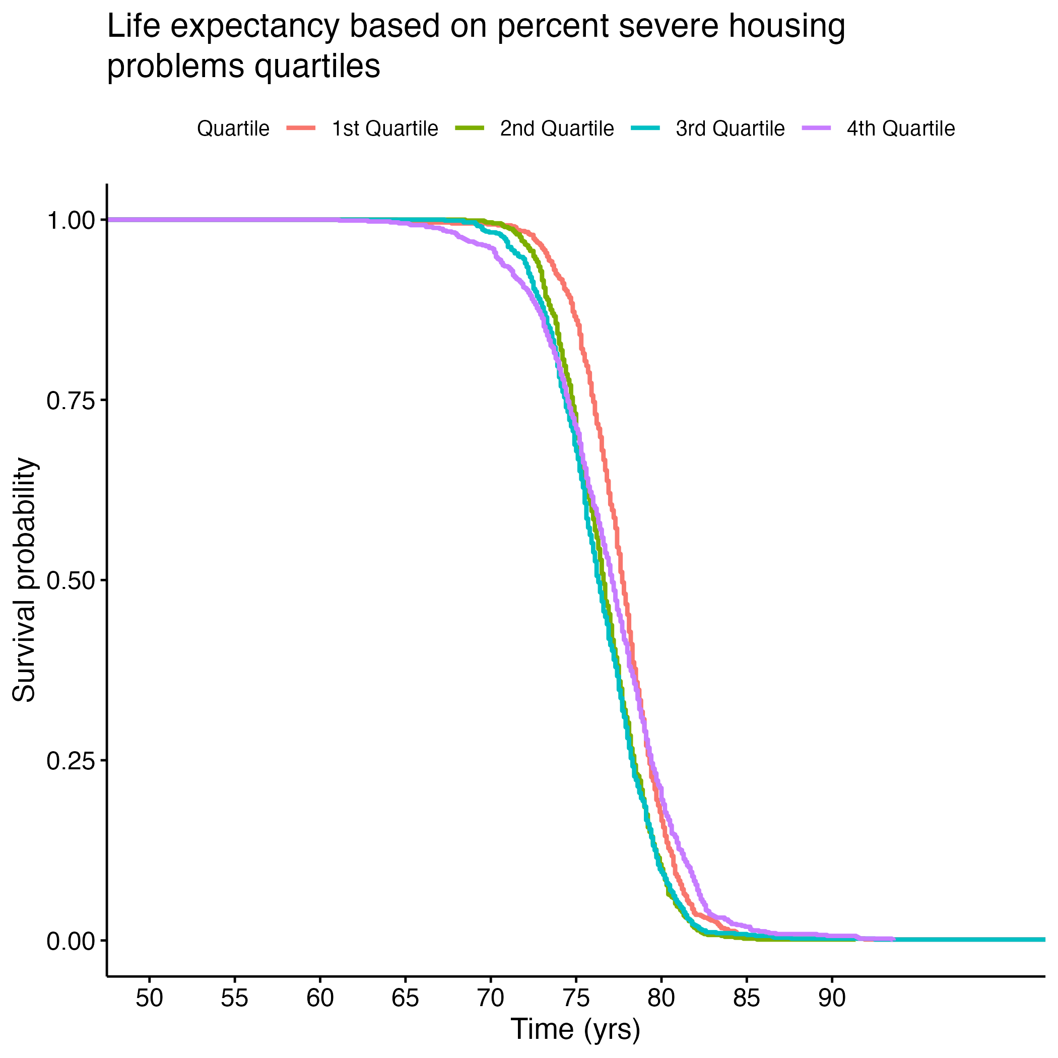
8.1.13 S. Table 6H: Log Rank Test Results Severe Housing Issues KM Curve
| Quantile | N | Observed | Expected | (O-E)^2/E | (O-E)^2/V |
|---|---|---|---|---|---|
| quantile=1 | 759 | 759 | 889 | 18.9 | 27.3 |
| quantile=2 | 784 | 784 | 671 | 19.0 | 25.1 |
| quantile=3 | 791 |
